Sideways Design Thoughts
In a bookstore in Rome, I noticed an Italian edition of Jorie Graham’s To 2040 (2023) from across the room: what caught my eye was the shape of the book. This is a tall book, kind of like a pocket novel; by contrast, Graham’s recent poetry uses a very long line (what typographers call the “measure”). A long line and a narrow page don’t work together very well: whoever’s setting the poem has to break the line to make it fit. It used to be that these run-over lines would be on the right side of the next line with a “[” to the left to indicate that something had overflowed; since computerized typesetting, it’s more common that a run-over line of poetry is indented, though then you run the risk of confusing the poet’s indentation with the side effects of typesetting. The American edition, by Copper Canyon, deals with the problem my having a wider page; the result is a tad inelegant. Translation often means even longer lines, compounding the problem. How would Crocetti Editore – who publish a number of facing-page translations – solve this problem here?
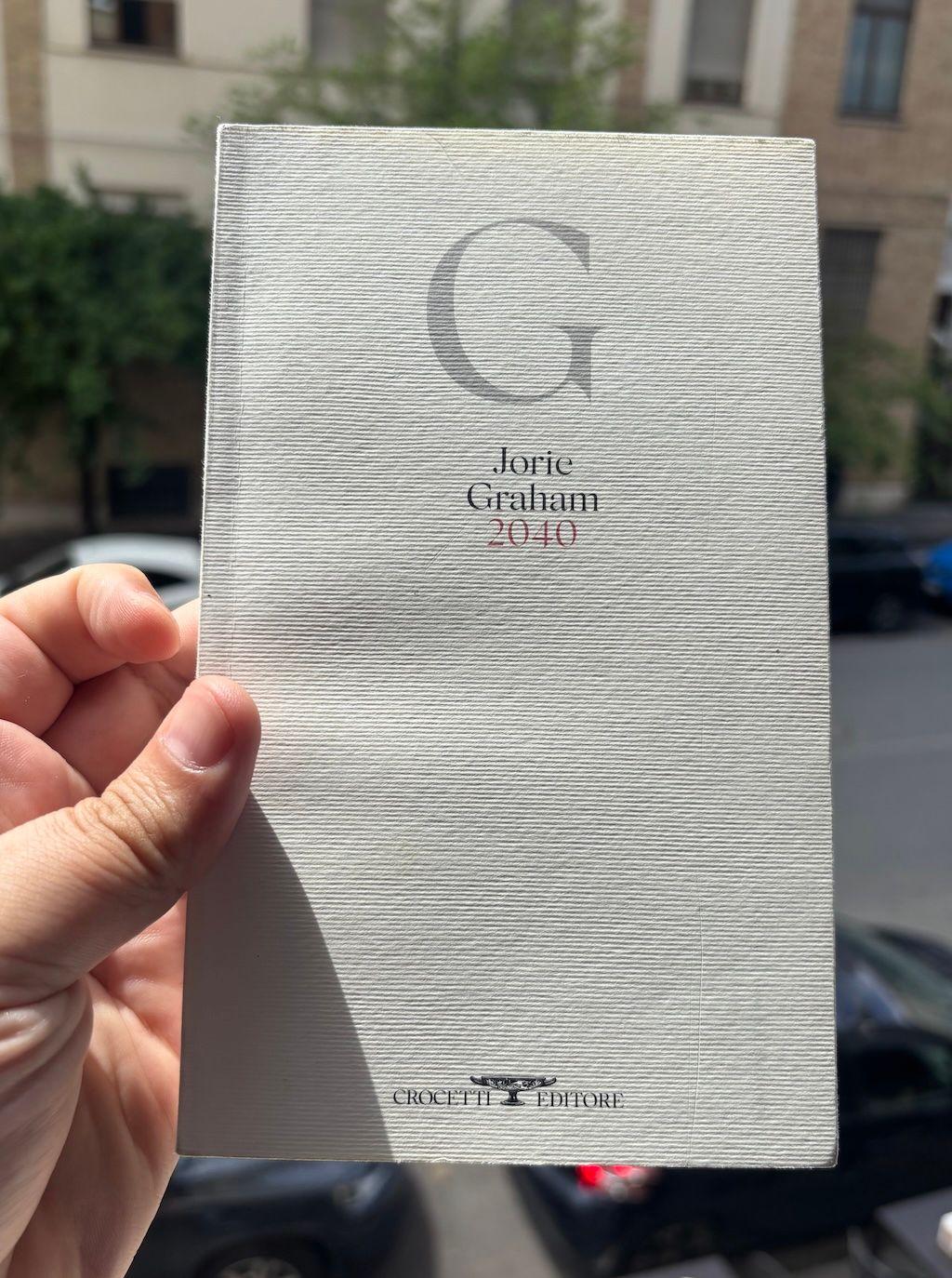
The cover of Jorie Graham’s 2040, in Italian translation by Antonella Francini, published by Crocetti Editore, 2025. It’s a tall book.
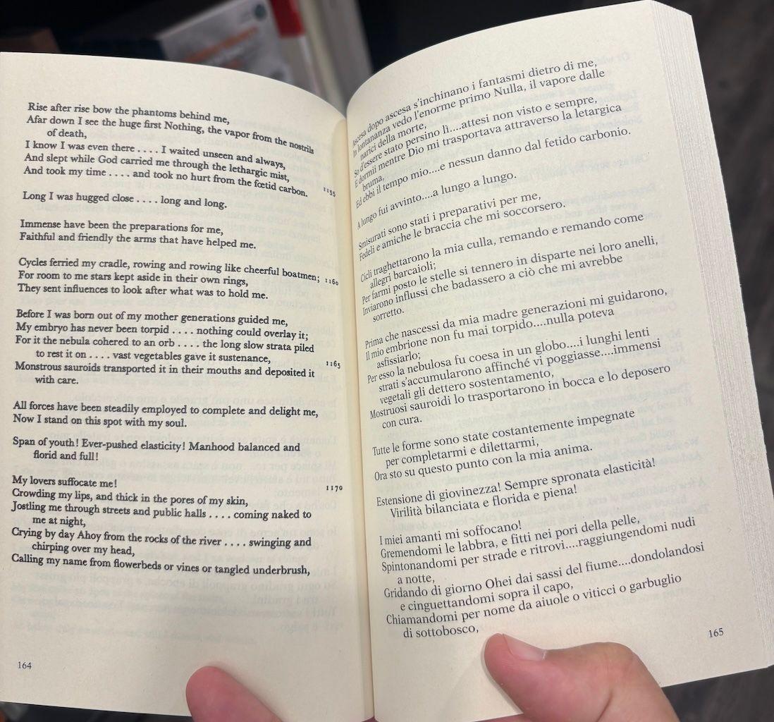
With some ingenuity, it turned out. Whoever put this book together – Cristiano Guerri is credited as the art director, and Antonella Francini translated the book with the collaboration of the author – decided to rotate the page by 90 degrees. To read the book, you have to hold it sideways, but there are no roll-over lines at all. Some poems are right-aligned; they have plenty of space. It’s a smart idea! And there’s a bonus: this is actually a facing-page translation. The top/left page is in English; the bottom/right page is in Italian. Because there are relatively few lines on a page (and there’s an English version), the book is much thicker than the original, around 300 pages.
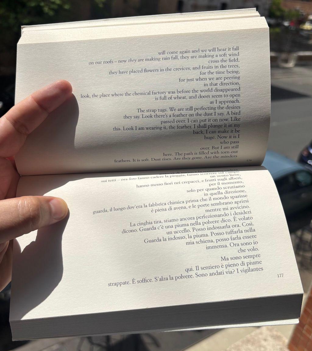
An interior spread of the Italian translation of To 2040. The text is rotated 90°; the left-hand page contains the English original, while the right-hand page contains the Italian translation.
It’s an interesting approach. There are precedents for this: the one I think of is Michel Butor’s Mobile (1962), which in the French original also went sideways. (The English translation managed to lose this.) The effect in that book – loosely considered a travel journal through American place names – is river-like, a cascade of words. Turned sideways, the codex feels a bit more like a scroll.
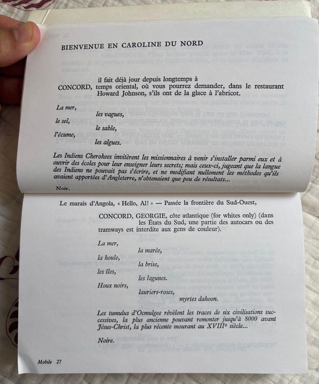
A spread from the French original of Michel Butor’s Mobile. The text is rotated by 90° and reads from the left page down to the right page.
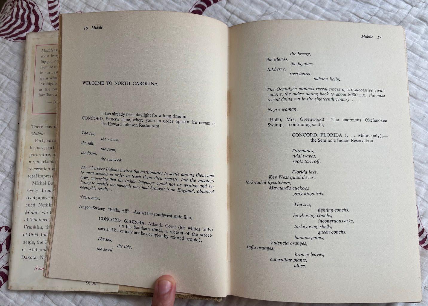
The same spread from Richard Howard’s translation of Michel Butor’s Mobile. This is laid out in the usual way: it goes from top to bottom on the left page, then top to bottom on the right page. The effect on the reader is slightly different.
The Italian 2040 feels a bit like that, though the interleaved English gets in the way of the flow: the (presumably bilingual) reader starting from the top would read a bit of English, then the same thing in Italian, then move on to the next page: repetition slows the rhythm.
(I would not present myself as an expert on the history of Italian poetry design: though I haven’t seen one, I wouldn’t be surprised if there were an Italian edition of Walt Whitman that looked like Francini’s 2040. Francini also translated Place as Il Posto, but I haven’t found a copy of that yet.)
A facing-page translation of Whitman’s Leaves of Grass, translated into Italian by Alessandro Ceni, published by Feltrinelli in 2015. Note the roll-over lines on both sides.
Could we do a Circumference book like this? I don’t think we’ve seen something with such long lines – poets, after all, tend to write for an imagined publication, and the imagined book page is usually tall and narrow. (The paper used for printed drafts might come into this as well: European printers use A4 paper, designed to have proportions more similar to those used in books than the comparatively squat 8.5″ x 11″ format used by American printers. Is the shape of paper connected to the length of lines a poet uses? Someone should write a thesis on this – but that’s a problem for another time.) It does feel unfamiliar to turn a book sideways to read it! But for the right book, it could be a good solution.