Thoughts
Design Me, Kenyalang 3: The Cover
(This is the third in a series of posts on the design of Kulleh Grasi's Tell Me, Kenyalang. Read the first one and the second one if you don't want to be confused.)
Most book covers are terrible for very predictable reasons: they are effectively designed by committee. An editor gives an idea to an outside designer who probably has not read the book; the marketing department has concerns; the publisher, who's paying for the whole thing, might not like a color; the author may demand that things be taken in a different direction. At Circumference, we do not have the luxury of being terrible for that reason because we are too small and do not have, for example, a marketing department to yell at us.
We still want the cover to be nice. But the purpose of a cover design is very different from the purpose of the interior design. A cover’s job is to make a potential reader pick the book up and buy it, while the interior's job is to support the text. The concerns of the cover are primarily financial rather than aesthetic or literary. As someone who cares more about ideas than things, this is less interesting. But a cover can still convey something interesting.
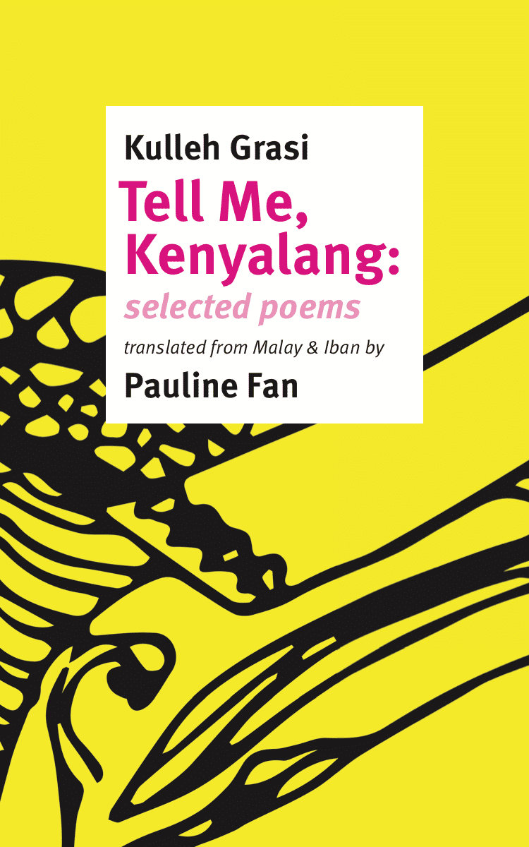
The cover of this book actually started before we’d published any books: we had to have an image to represent the covers of our first two books – two so that people could subscribe. Again, the cover’s reason for being is financial. But we had to have two book covers and they had to contrast. We had our logo – cyan, magenta, yellow, and black – and using yellow and magenta as the primary colors of the two books was easy. Camouflage was magenta – the title is still magenta – and, without very much thought, Tell Me, Kenyalang became yellow. And somehow it stayed yellow.
There were a number of different fake covers that we used which aren't particularly interesting. An inflection point happened when I realized that kenyalang was the word for the rhinoceros hornbill, a photogenic bird if ever there was one. It's a very strong and immediate image that's easy to visualize – just like the word camouflage. Problem solved! There are plenty of old Victorian paintings of hornbills. We could use one of them. But this is not right. A British colonial painter looking at a hornbill in the nineteenth century was seeing something very different that an Iban poet does in 2019. Colonial portrayals of hornbills don't actually have anything to do with this book.
A placeholder cover. What a fine-looking bird! I don’t remember where this image comes from.
Another image came my way. I discovered the work of Carol Rubinstein, which is really worth talking about at great length by itself. She went to Borneo in the late 1960s and spent several years living with Dayak groups, recording their songs and poetry. The Sarawak Museum in Kuching published two enormous volumes of her work as issues of the Sarawak Museum Journal in the 1970s (and a handful of selections of the poetry were published by other presses and ended up in Jerome Rothenberg's anthologies of ethnopoetics). The title page of one of the volumes features drawing of a kenyalang. Perfect, I thought, here's a kenyalang, one that has previous experience with poetry in translation. That's our bird.
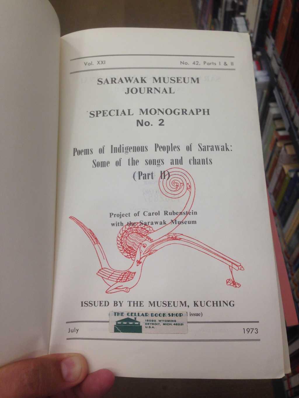
Volume II of the Sarawak Museum Journal Special Monograph No. 2: Poems of Indigenous Peoples of Sarawak: Some of the songs and chants (Part II). This particular volume seems to have traveled from Kuching to Detroit, then, somehow, to New York, then to Singapore, where I took this picture and gave the book to Pauline Fan, who gave it to Kulleh Grasi who brought it back to Kuching.
Because of a desire to have this book match our first book, I took that photo of the kenyalang and turned it into a shape – the same thing I did to turn the image of a tree into camouflage. The first thing I did was to make it black and put it on a yellow background with the title treated just as in Camouflage:
First version of a cover with the kenyalang design.
This pretty clearly moved to the abstract: the drawing isn’t really recognizable when it’s just the front cover (though it becomes more recognizable when the flaps are opened). I like this: it’s striking. But it also seemed like I was inadvertently plagiarizing Andy Warhol’s design (and color palette!) for The Velvet Underground & Nico:
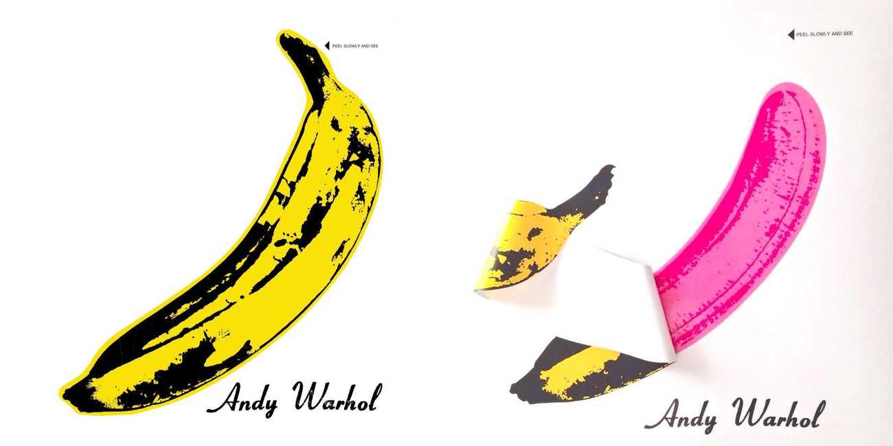
Andy Warhol's 1967 design for The Velvet Underground & Nico in unpeeled (left) and semi-peeled (right) states.
That’s a great design – particularly when the banana could be peeled off. But it doesn’t quite fit; and variations on that design are everywhere in Southeast Asia for the past few years, pretty quickly going from signifying a hipster to just being another part of vernacular fashion. And a similar issue came to light when I spent a little time in Borneo: just like the VU banana, the kenyalang image is on everything. Here, for example, you see it on the Sarawak Hornbill Tourism Award:
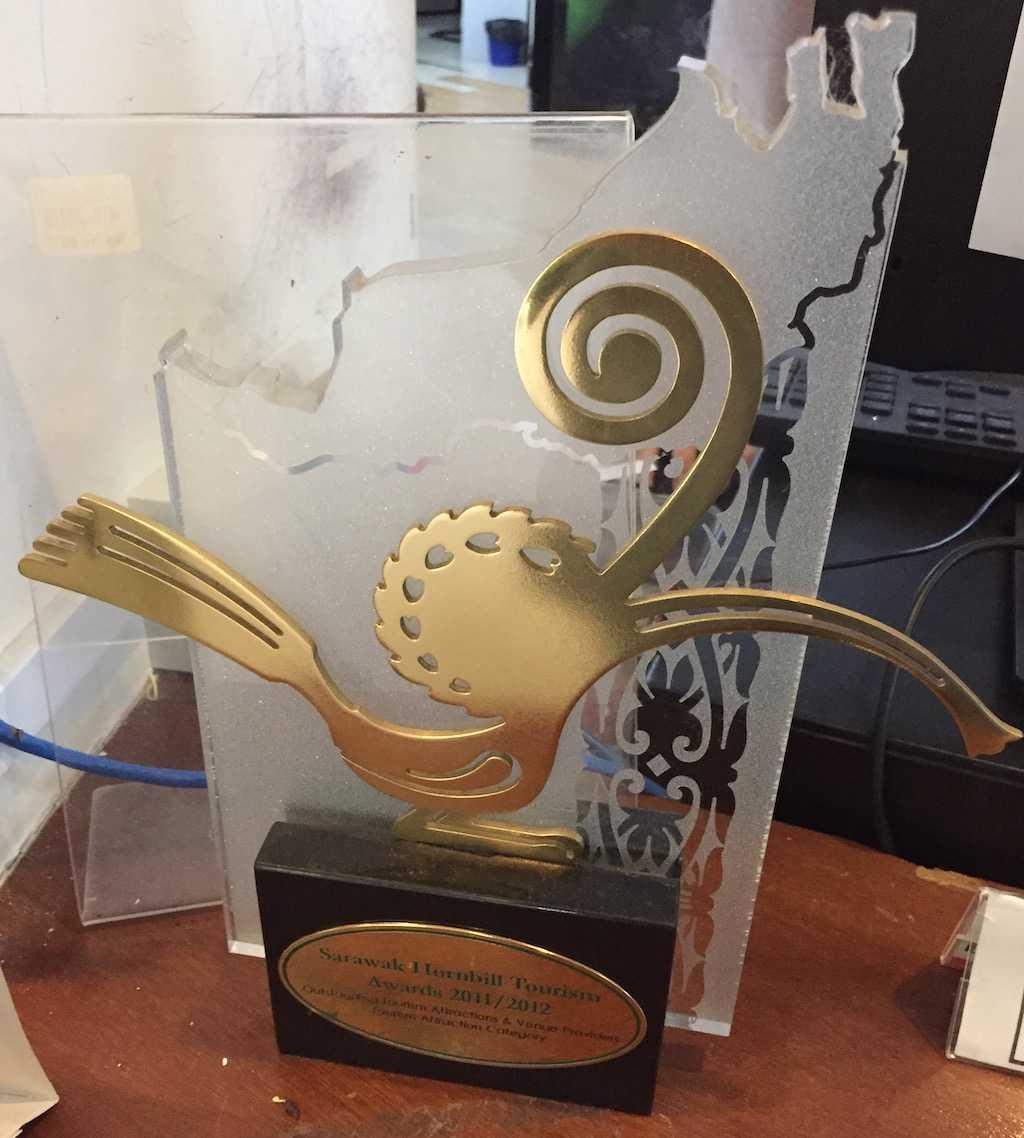
Good work, Gunung Mulu National Park!
Again there’s a reason that this image is popular. It’s a good design. But it also signifies preconceived ideas about Borneo: as the place where you go on a fancy vacation to see the orangutans. This is not what we were trying to convey. Kulleh’s poetry moves back and forth between the ancient and the modern: one of Tokyo’s airports is in there along with Iban mythology.
What I wanted was to keep the kenyalang but also mix in something else. I thought of the weaving designs that Bruce Mau used for some of Zone’s books in the 1990s:
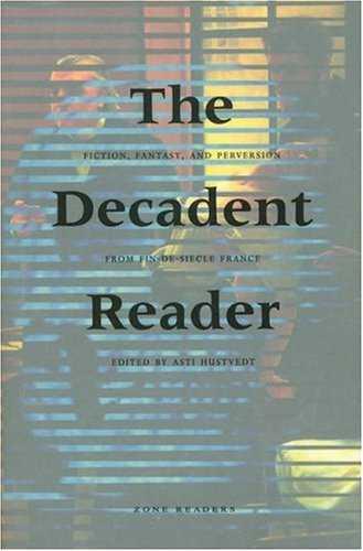
Cover by Bruce Mau for The Decadent Reader (Zone Books, 1997) – the interwoven images are hidden by a translucent outer jacket. More info here.
Conceptually that’s maybe a little too direct in its equation of sex and death (though it’s a fine choice if you’re making a cover for The Decadent Reader) through intercutting images. Trying to do something a bit subtler but with the same kind of effect, I decided to use the kenyalang shape as a mask. It could be some kind of glitchy Blade Runner future city seen through the kenyalang. Here’s a version with a weird hotel in Lisbon filling that function:
It's hard to tell, but this shows the glassy insides of a hotel. There are weird dangling jellyfish sculptures as well.
I like the interplay between the organic shape of the kenyalang and the rectilinear lines of the architecture. But this is maybe going too far: that contrast I was trying to look for was already there. You can see the modern in the monochromatic background, the digitally processed shape of the kenyalang drawing, the typography. Things are starting to get lost; trying to figure out what the shape is as well as what's in the photography behind it is visually challenging. So I stepped back, and instead put in a photo I had taken from a river in Borneo, the forest and the sky above the water. It's not a particularly good photo:
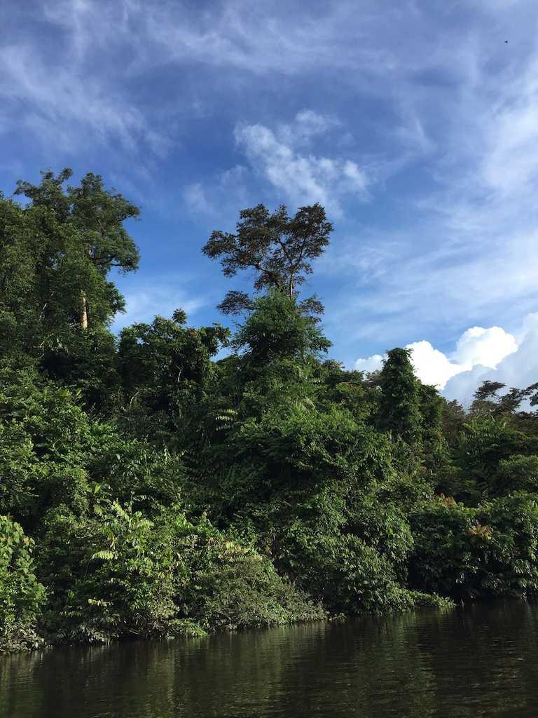
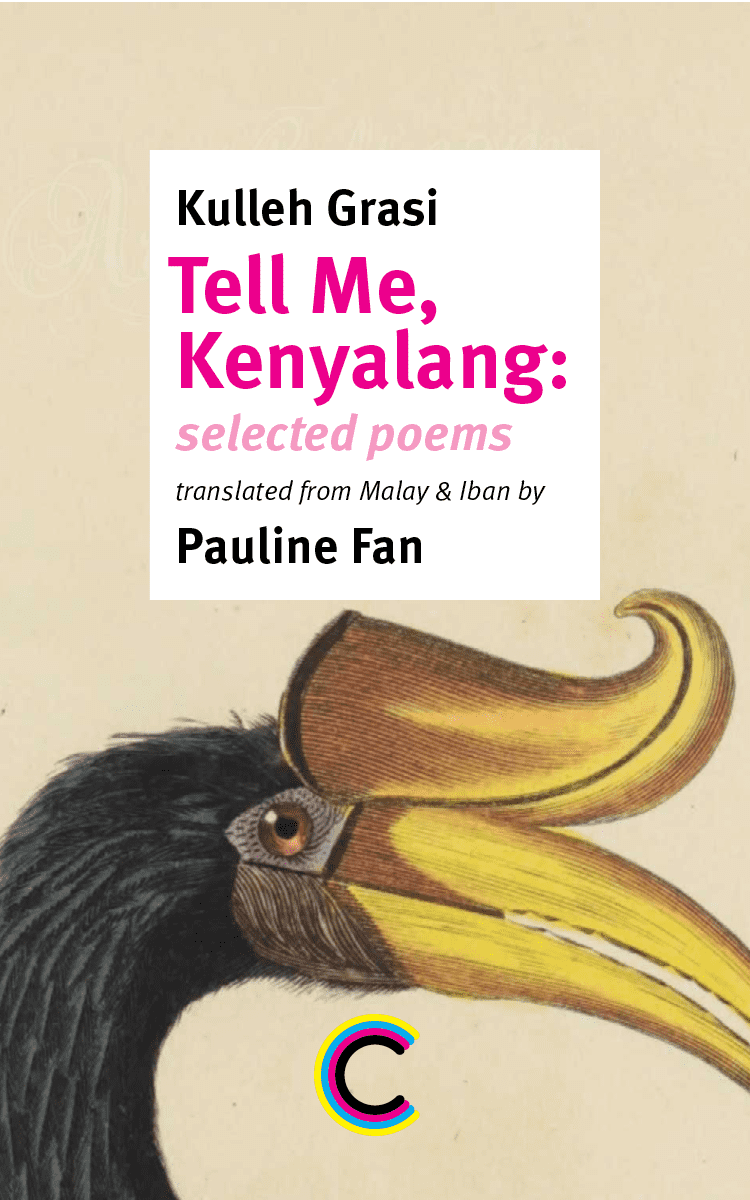
But in context it works, and the cover seemed to snap into place. The trees mirror the trees that are on the front cover of Camouflage. And, with a couple of tweaks, that's how we ended up with this cover:
Design Me, Kenyalang 2: insides
(This is the second in a series of posts on the design of Kulleh Grasi's Tell Me, Kenyalang. Read the first one here if you don’t want to be confused.)
A lot of design – even good design – is lazy: we use existing solutions because they’re familiar and they work; the reader doesn’t need to think too much. And so many of the interior elements in Tell Me, Kenyalang are from the generally accepted model of facing-page translation; and a lot of the rest is taken from Camouflage (in part because these are two books that can talk to each other).
The difference starts coming in with the words from Iban and Bidayah and the other languages of Borneo. While you could just read the poem aloud and appreciate the sound of the words, the tricky thing about words is that they mean something. In Camouflage, like in a lot of books in facing-page translation, it’s not that hard to look at a word in Galician and get a rough idea what it means by working out which English word it corresponds to, even if you don’t speak any Galician. This isn’t the case in Tell Me, Kenyalang: the vast majority of all readers, even those who speak English and Malay, will not understand some of the words. Most readers don’t have recourse to dictionaries of these languages; my standard response of pulling up Google Translate on my phone gets me nowhere.
So we have a lot of notes which Pauline Fan very helpfully put together which explain the terms in the text, what they mean and where they come from. Notes are a problem from a design perspective. Footnotes or side notes are helpful because the reader doesn’t have to turn the page, keeping another bookmark in the back of the book. This isn’t a great solution for poetry because then the poem never gets to stand by itself: it’s visually encumbered by whatever’s around it that is not part of the poem. A poem should not look like a legal document with a lot of fine print at the bottom of the page. I think that’s particularly important for a book like this one: many of the readers may never have read any poetry from Malay (let alone the languages of Borneo), and might find the idea of reading this to be slightly imposing – the fear of setting off into the unknown can be even greater when you’re overwhelmed with the sense of how much you don’t know. (You might think of the Talmud, where the visual design makes it clear that you would need to spend a life grappling with the book to really do it justice.) And Kulleh Grasi’s poetry is actually not very hard to engage with – it’s very direct, even if it’s coming out of a landscape and history that the reader may not know. But it’s not in any way something to be afraid of: this is a book for everyone.
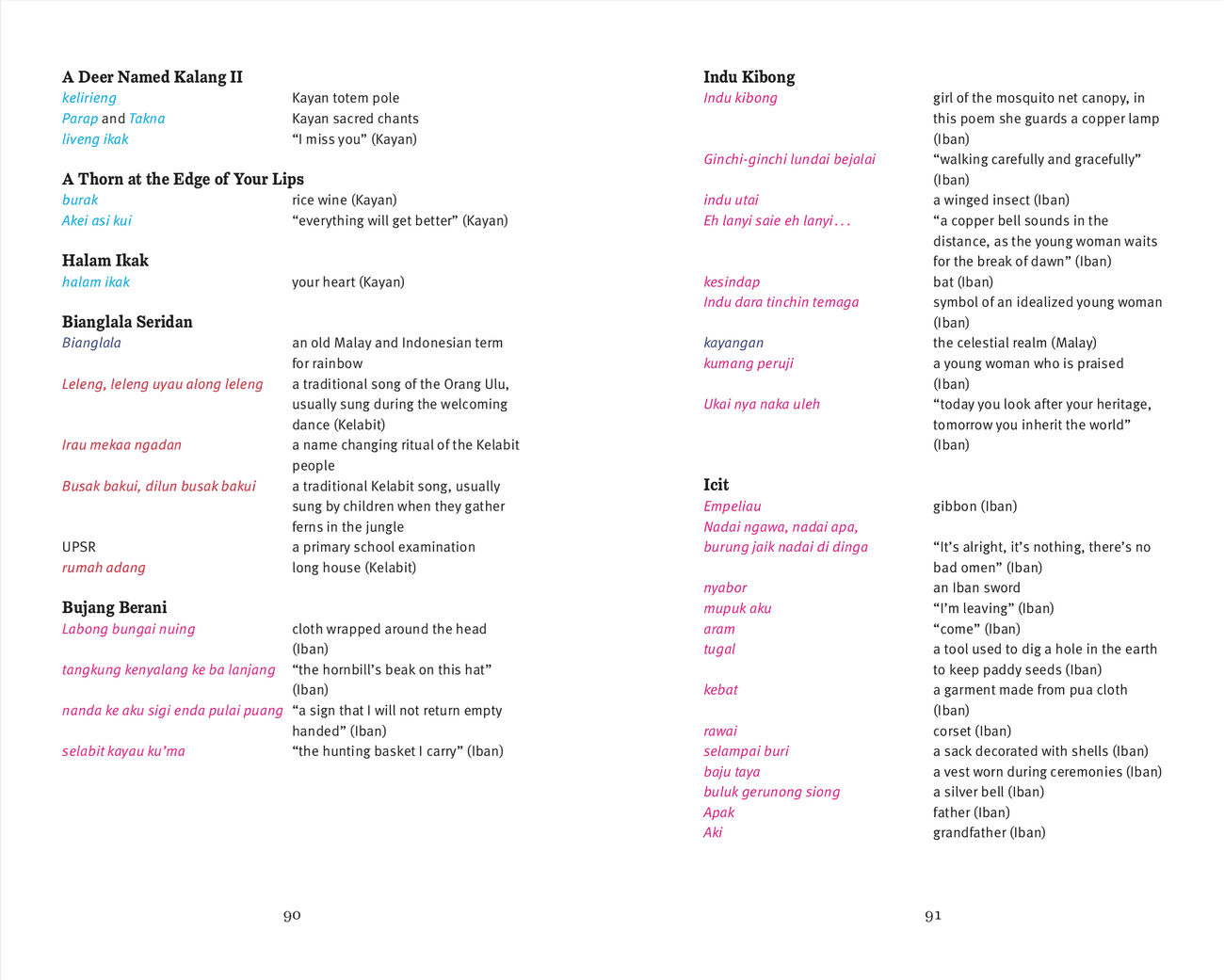
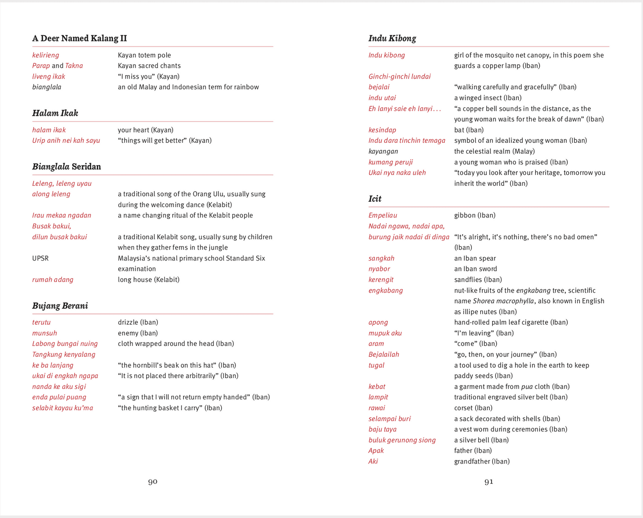
So I banished the notes to the back of the book. There were a handful of revisions to the way these were arranged – what I ended up doing was pulling them into a table-like format which makes it easy to see which languages things are coming from. (This arrangement also inadvertently makes something clear about the text – the way languages come in and out isn’t random but very intentional, part of the journey taken by the speaker.) Snapshots of a couple of different revisions from the process:
The first version of notes. To keep them straight, I was giving phrases from each language their own color.
The second version of notes. A bit more readable; there's one color for non-Malay languages. Still some spacing issues.
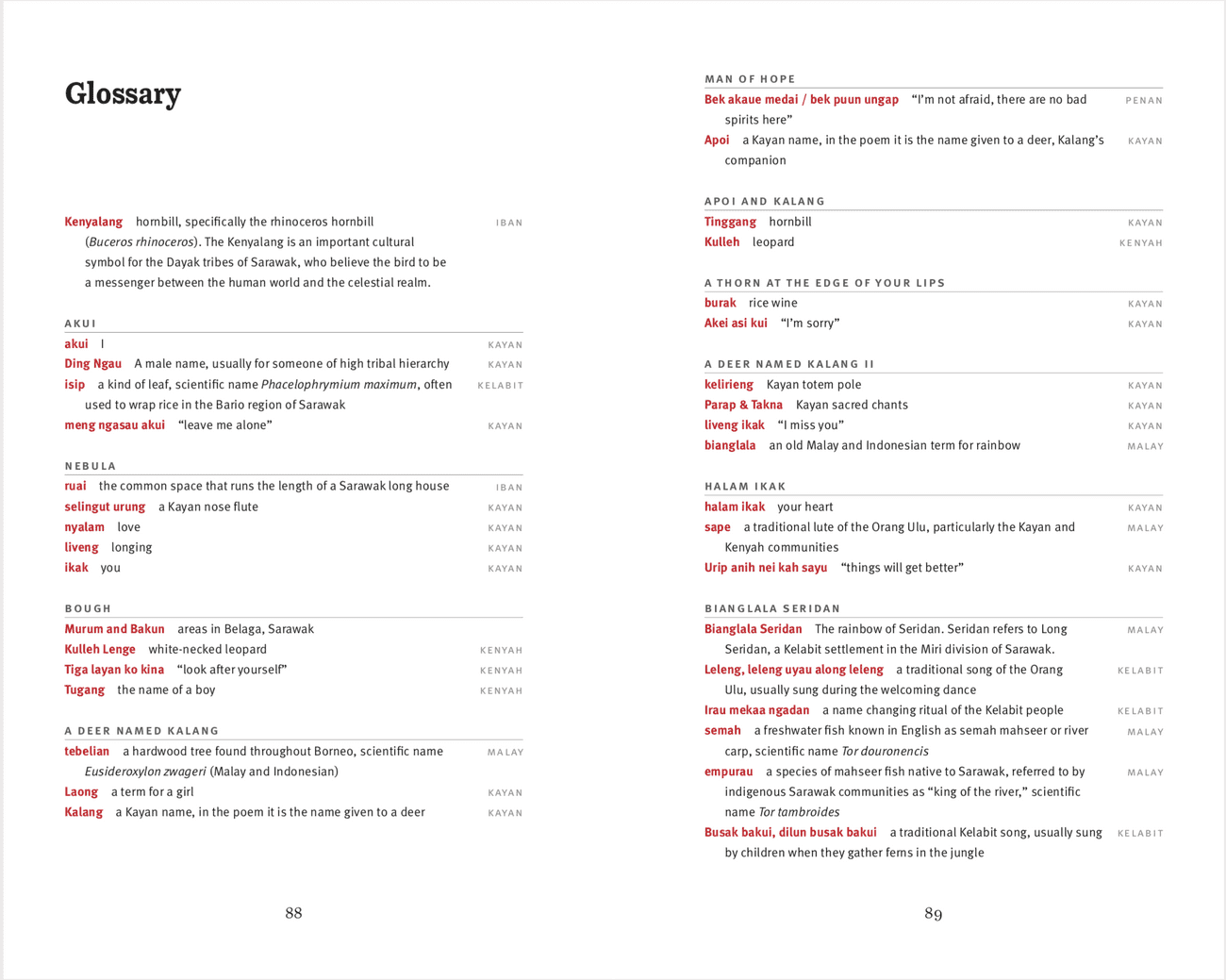
Now languages are separated out into columns. Everything suddenly becomes more clear!
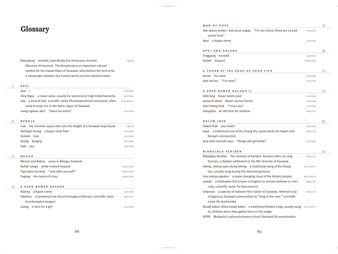
And in the final version: page numbers are added in the margins to help the reader find their way back to the poem.
That last version – what’s in the printed book – brings me back around to the question of different languages and how they should be treated in the text. I have been pestering Jenny and Stefania for a very long time to let me set poetry in translation in two colors: the first design for Circumference the journal is long lost, but I wanted the interiors to be in black and red ink. The reason that didn’t happen is pretty obvious: printing in two colors is generally twice as expensive as printing in one color, and people do not seem to be falling over themselves to give us a lot of money to print luxurious editions of poetry in translation. But I asked again for this book, and our printers came back with a quote that was surprisingly reasonable.
A Circumference poster from 2004, fifteen years ago. We are very old.
One issue created by moving the notes to the back of the book is that there’s not necessarily a way for the reader to know that there’s a note they should be looking up. You can add superscript numbers or asterisks, but again that clutters the space of the poem with things that are not part of the poem. What is wanted is a visual indicator that shows that there’s something else; but, crucially, one that doesn’t distract from the reading experience. Using a second color of ink does this. It also helps that we can color words regardless of whether they’re roman or italic. It’s effectively adding another axis to the text. As for which color: very early I settled on gold. There are a raft of associations that come with gold, of course, but I liked the image of gold words sparkling amidst the regular black ink, like something secret and buried coming to light from under layers of dirt. Is that what we actually achieved? I don’t know. If we go back for a second printing, I’d add a spot varnish so that it sparkles more, like gold leaf. But if it sparkles more it might be too distracting? There are always compromises.
And it might be worth talking for a bit about the electronic forms of the book – there have been two so far, and who knows what might happen. If you’re a subscriber, you can go to the subscribers’ page and read the whole book online. If you not, you can go to the book page and read one poem from the book per day for the month of November (or whenever we remember to turn it off). What you see there is another form of the book; it’s not perfect, because it’s still a tremendous pain to set poetry online, let alone when you’re dealing with two languages and you’re trying to making something that you can read on a computer or a tablet or a phone. But it mostly works. There the reader has a bit more choice about how to read the poem: if you’re looking at it on a phone with a narrow screen, for example, you’re forced to read either the English or the Malay. If you’re looking at it on a bigger screen, you can see both at the same time.
There’s one way, I think, in which the electronic version is superior to the print one: and that’s how we deal with the notes. Because the screen you’re looking at has to compose color in terms of red and blue and green blobs of light, there’s not really a way to have gold text. We could have a dark yellow color, but at best that would be like a photograph of gold rather than actual gold, a crummy copy. But we can make the color cycle! So I did that, which creates a similar, but different, feeling. That’s not what’s better about the electronic version – I think that’s probably distracting, a little too flashy for serious reading. But that’s okay: we are ostensibly a business, and we do want the people coming to the book’s page to buy the print book. (If you’re a subscriber, you should have a print copy – if not, please let us know! – and the electronic version is just a cherry on top.) What’s better about the electronic version is the ability to go to an annotation without losing your place in the text: click the colored text to bring up an annotation, click again to make it go away. There’s less distraction to the practice of reading than you have with the print version.
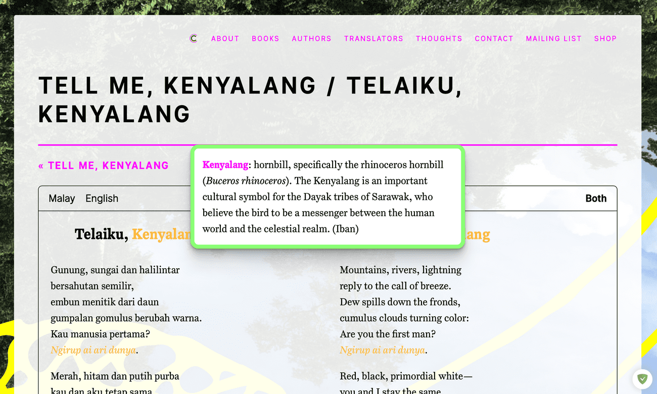
What you see on the subscriber page if you click on a note.
I should probably talk about the cover! Next time.
Design Me, Kenyalang 1: Background
We have a new book! And design-wise it’s similar to our first book, but also very different. I want to talk a little bit about the design of this book: how it came about, some of the things that we imagined, and the different places that this project has gone and will go.
The first thing I did was make a mistake. I heard about the book from Jenny who had been told about it by Pauline Fan, the translator. And my first understanding of the book was that it was an English translation of a Malay version of an Iban original, some sort of weird double translation. I had not actually seen any of the text at this point. But the image that came to my ignorant mind was of something layered, of moving through different levels of language to reach the meaning of the text. And this made me think of the exciting part of encyclopedias when I was a child, the transparent pages that you can layer to show the various anatomical systems of the body and how they fit together:
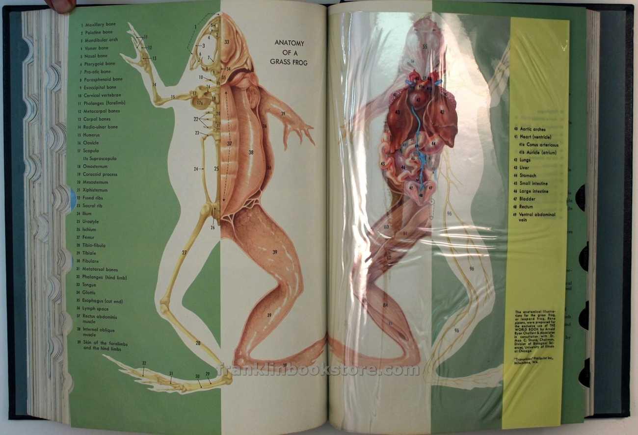
Different layers of the anatomy of a grass frog in a 1965 World Book Encyclopedia for children.
What we would do, I thought, is publish three texts that would be on top of each other – we’d find some printer that could make half the pages out of cellophane, and the English page would overlay the Malay page which would overlay the Iban page. This idea, of course, bears no relation at all to the actual book. The actual text of the original is mostly in Malay, but with a lot of words and phrases from not only Iban, but many other indigenous languages of Borneo. (The keen-eyed might have noticed that this website used to describe the book as “translated from Malay and Iban,” though it’s moved, mostly to “translated from Malay”. Maybe it still says that somewhere?) And a lot of (but not all of) those words appear in the English text as well. So I shelved the idea of layering, though that’s something that will come back in later.
I started by falling back on putting the Malay text and English text side by side. Yes, this should be read as a bit of a cop-out in the light of how we threw out all the rules of poetry in facing-page translation when we made Camouflage. But a tenet of design is that one follows the rules until you’re good enough to break them. And putting the texts side by side actually is interesting: in a lot of these spreads what you notice with Tell Me, Kenyalang isn’t what’s different between the original and the translation but the sheer number of words – mostly those from the indigenous languages – that are shared between them. This isn’t what you’d expect from two languages that don’t share a lot of cognates. And you have a sense – even if you don’t speak a word of Malay – which words are those from indigenous languages, because most of them are italicized.
Maybe it is worth talking for a little bit about italic and Roman type. Roman type – the upright type that most things are in – is more of a mutt than its name suggests. The capital letters, of course, come from the inscriptions of the Roman Empire: it’s the lettering of power. But lower-case letters don’t come from Rome at all: they were only invented by monks in the Middle Ages to save space when copying manuscripts. Sticking the two together makes a nice rhythm; too much lowercase becomes claustrophobic, perhaps what might be expected from its monastic origins. Italic type comes from fifteenth-century Venice: it imitates not the capitals of imperial inscriptions or the lowercase of monks but rather the elegant handwriting of northern Italy. It is a design based on aesthetic pleasure rather than on the demands of power or religion. Aldus Manutius saw italic as a superior alternative to Carolingian miniscule and set whole books in it, though this is not something one sees done very often any more. Illustrations:
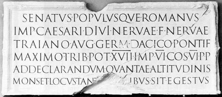
The text on Trajan's Column in Rome, carved in stone 1900 years ago, is basically identical to the way we use upper-case letters today.
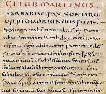
Handwritten lowercase (“Carolingian miniscule”) from the middle ages.
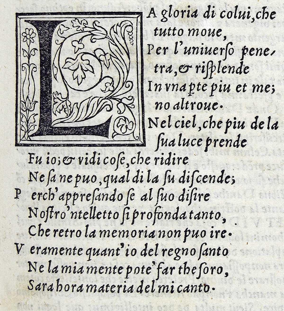
Type designed by Francesco Griffo in Venice around 1500. Note that he’s using what looks like lower-case italics with Roman capitals.
Viewed historically mixing Roman and italic type as we do today is thus a sort of cultural mixing – one suspects the inventors wouldn’t have wanted anything to do with one another if they had any choice in the matter. But generally the usage in English has been to set foreign words in italic: to set them off, to mark them as being apart, something not quite assimilated. And this is maybe appropriate for Kulleh Grasi’s Malay, which is full of other cultures – like the cells of our bodies, which contain mitochondria, tiny energy factories that were once free-living bacteria until hundreds of millions of years ago they took up residence in the cells of our ancestors.
But I digress. Malay, it should be noted, is mostly written in Roman script today; that reflects British colonialism. (The Dutch colonial system, which was running much of what’s now Indonesia, had very different language policies, but that’s a subject for another time.) Before the British, most Malay would have been written in Jawi, a modified Arabic script; the British imposed Roman scripts on Malay, and that’s largely what’s used today. And the Dayak languages are from outside of the Muslim Malay world, though they did engage with it. The point of all of this is that even before we start thinking about what the words means, by just looking at the visual symbols that comprise them, there’s a huge amount of historical baggage that, consciously or not, is going to impact the way we read.
So we have a text that consists of other kinds of texts, which have complex – and very loaded – interrelationships. Next time: we’ll go through how this comes out in the text.
Singapore Writers Festival Wrap-Up
Kulleh Grasi, Pauline Fan, and Kulleh's band Nading Rhapsody all appeared at the Singapore Writers Festival this year. Some photos and videos for those who couldn't make it:
Translator Pauline Fan and poet Kulleh Grasi seeing the book for the first time.
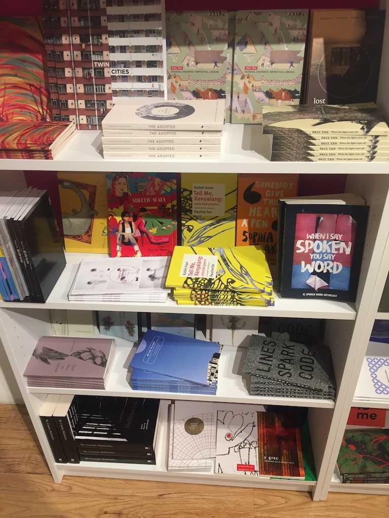
Our book is real! And available in the festival bookstore.
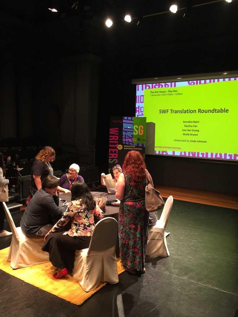
Pauline Fan on a panel. It is impossible to make a panel look interesting, and the lighting of this one made it look like a prison interrogation.
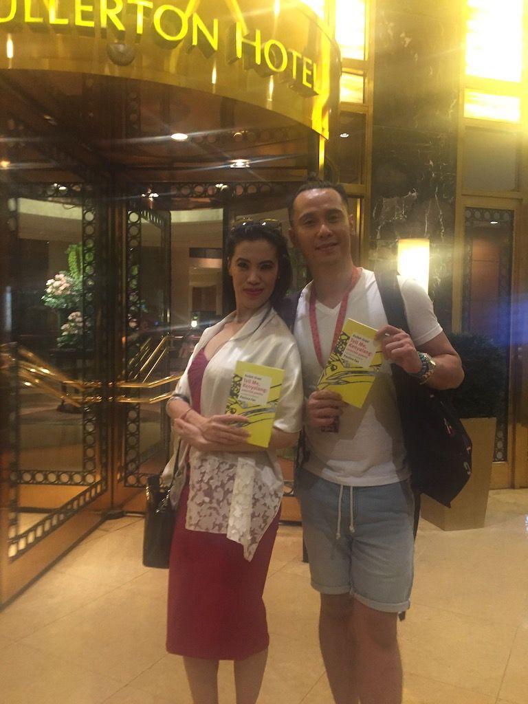
Poet and translator and book, right before Nading Rhapsody's first performance.
Kulleh Grasi on a panel.
Kulleh Grasi being interviewed by Singaporean television after the performance – we should figure out whether this ever aired! Also Kulleh was interviewed about the book on Malaysian television last week, which we should also find.
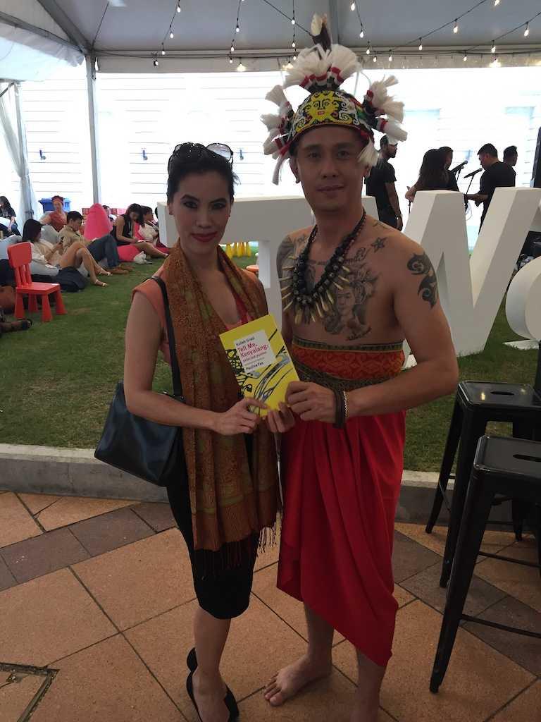
Poet and translator after the show.
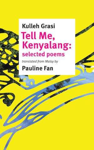
Tell Me, Kenyalang is out!
Our second book, Kulleh Grasi’s Tell Me Kenyalang, translated by Pauline Fan is out today! If you don’t already have a copy, you can get one from our store.
Are you feeling unsure about buying poetry sight unseen? If you visit the book page for the month of November, you can read the book yourself! Or you will if you keep visiting that page: for every day of the month of November, we’ll post a poem from the book – the first poem on the 1st, the last poem on the 30th. The cheap (and dutiful) can read the book that way! If you don’t think you can reliably visit that page every day of the month of November, you are more than welcome to visit the store, where you can buy a copy of the print version and read the whole thing, along with Pauline Fan’s introduction.
(And consider becoming a subscriber? If you were a subscriber, you would have been able to go to our secret subscribers’ page a few weeks ago and read the whole book (and the introduction!) online. Subscribe now and you can still get in – and you’ll get our next book, which we’re not quite ready to announce, but we will very soon.)
Tell Me, Kenyalang at the Singapore Writers Festival
We have some events coming up for Tell Me, Kenyalang if you happen to be in Singapore! Poet Kulleh Grasi, translator Pauline Fan, and Kulleh Grasi’s band, Nading Rhapsody, are going to be appearing at the Singapore Writers Festival. Here’s the schedule of events:
- Saturday 2 November, 5 p.m.–6 p.m.: Pauline Fan appears as part of a panel entitled SWF Translation Roundtable with Babak Tabarraee, Lian Hai Guang, and Shelly Bryant.
- Saturday 2 November, 6:30 p.m.–7 p.m.: Nading Rhapsody performs at the SWF POP Stage
- Sunday 3 November, 10:30 a.m.–noon: Kulleh Grasi appears on a panel entitled The Death of Languages with Louis-Jean Calvet, Caryl Lewis, and Waubgeshig Rice
- Sunday 3 November 7:30 p.m.–8:30 p.m.: Pauline Fan appears as part of Navigating the SEA with Joshua Ip, Martin Villanueva, and Christine Chia.
- Sunday 3 November, 8 p.m.–9:30 p.m.: Nading Rhapsody appears in A Spotlight on Indigenous Voices with Wab Kiew, Melanie Mununggurr-Williams, Moe Clark, and Annaliza Bakri.
The Nading Rhapsody performance is free; other events are ticketed. While the price per event seems ludicrously high, you can buy a Festival Pass for SG$20 if you buy before the end of September; after that, it’s SG$25.
Tell Me, Kenyalang is out soon!
As mentioned, we’re putting the finishing touches on Kulleh Grasi’s Tell Me, Kenyalang, which will be out at the beginning on November. But we have a handful of blurbs that we can share with you now:
Kulleh Grasi has channeled “the rhythms from sebayan, / qasidahs from bunian” to bring us the “fragrance of paradise” of his native Sarawak, the place at the heart of his akui-self that springs forth from the Sea Dayak longhouse community (“leaf of the world”) like a Kalang deer and suffuses his poetry with Iban myths, sensual beauty, ancestral bonds, dreams, and the songs of trees, birds, river, and sun-rain. Pauline Fan’s finely woven pua-kumbu translation comes to us as a blessing from kenyalang’s beak.
If you need a reason to believe in the value of translation, here are thirty. Pauline Fan’s versions of Kulleh Grasi’s poems teach Malay and Iban to English. Translation changes us, into and out of languages, thankfully, because without it we might not know what it is like to be young and full of myth, music, and meaning in Malaysia. This multilingual voice sounds like it’s from right now, because it is.
The vitality of poetry hides in its secret veins, from which the unordinary — words, images, dreams — spout and sparkle.
Kulleh Grasi’s verses affirm this and Pauline’s translation gives them a poetic rebirth.
There are many instances of enchantment in this collection of poems. As I see it, in Kulleh Grasi’s pieces Malay poetry finds its “minor literature” (in the Deleuzian sense)— as they create idioms that slip away from the confine of identity (“deterritorialized”) and are linked with issues of finding a voice within a language that is both alien and familiar. The poems stammer, as it were, and disrupt the typically linear, narrative-bound verses in mainstream Malaysian poetry.
What a gift.
Women in Translation Month
It turns out that it was Women in Translation Month in August, though we were too busy putting the finishing touches on Tell Me, Kenyalang and didn’t notice until the month was almost over. But! Women in Translation Month never ends at Circumference, or at least it goes on for another month. For all of September, you can buy Camouflage by Lupe Gómez for the reduced price of $13! Click here to visit our store and pick it up if you haven’t already – or buy another copy for a friend?
Snapshots from Work in Progress
The electronic version of Camouflage has taken longer than we expected it to! But it's on the way, and here are a couple of screenshots from the app in development:
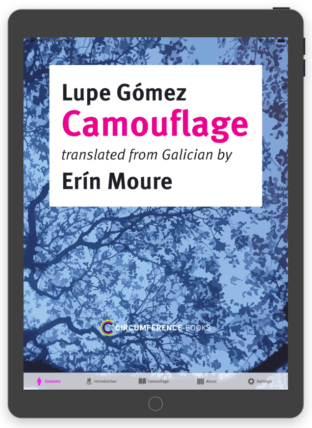
The main screen of the app in an iPad simulator.
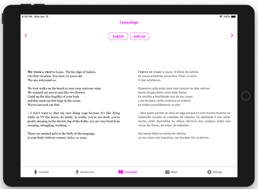
A spread from the book. Pressing the "English" and "Galician" buttons let you choose which languages you want to read in.
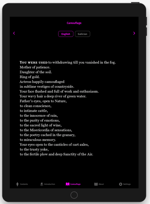
Just an English poem, in dark mode so you can read at night.
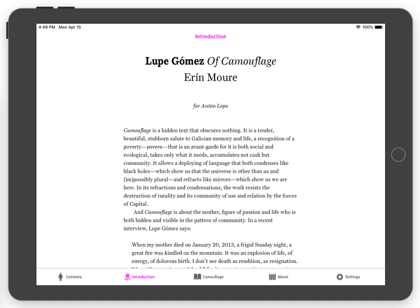
Erín Moure's introduction, in landscape mode.
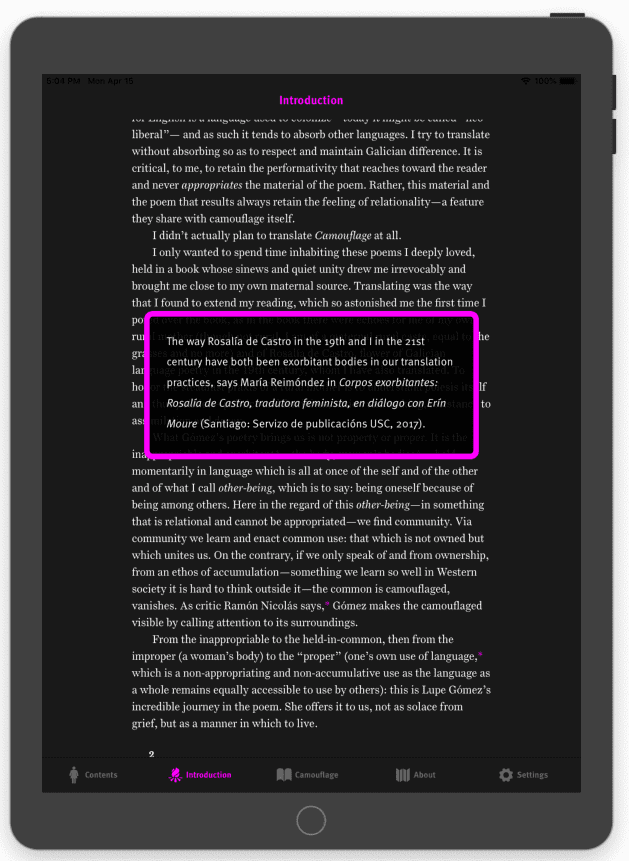
What about the footnotes? you ask. Footnotes!
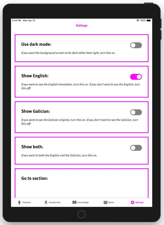
Also, for good measure, there's a settings page.
It's coming along! Any day now. This is being done in something called ReactNative, which will let us make both Android and iOS apps; and while the experience will probably be better on a tablet than a phone, it should work on phones too. If you're interested in beta testing, let me know? Potential Android tablet users would be particularly useful!
How does a book get made?
Making a book can be a complicated process involving a lot of people. In our case, it takes place all over the world. Here’s a diagram that explains exactly how it happened!