Thoughts
A Woman Looks Over Her Shoulder in New York
Poet Brynja Hjálmsdóttir and translator Rachel Britton will be discussing A Woman Looks Over Her Shoulder at Scandinavia House in New York on 9 January 2025 at 7 p.m. Details here.
Launch for The Rust of History
A launch for The Rust of History will be held in New York on March 3 at Bureau, 178 Norfolk Street. The event starts at 7 p.m., doors at 6:30.
Present will be:
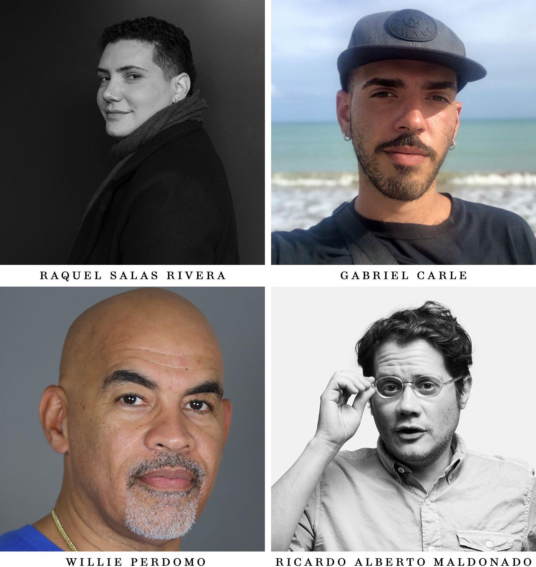
Raquel Salas Rivera (Mayagüez, 1985) is a Puerto Rican poet, translator, and editor. He is the author of six full-length poetry books, which have been longlisted and shortlisted for the National Book Award, the Pen America Open Book Award, and the CLMP Firecracker Award. His honors include being named Poet Laureate of Philadelphia, the New Voices Award from the Festival de la Palabra, the Lambda Literary Award for Transgender Poetry, the inaugural Ambroggio Prize, the Laureate Fellowship, and a National Endowment for the Arts Fellowship to translate the poetry of his grandfather, Sotero Rivera Avilés. He has co-edited the anthology, Puerto Rico en mi corazón (Anomalous Press, 2019), various folios, and the literary journal The Wanderer. This year he will participate in no existe mundo poshuracán: Puerto Rican Art in the Wake of Hurricane Maria at the Whitney Museum of American Art, whose title borrows a verse from his fourth poetry book while they sleep (under the bed is another country) (Birds, LLC, 2019). He holds a Ph.D. in Comparative Literature and Literary Theory from the University of Pennsylvania and lives, teaches, and writes in Puerto Rico, where he also works as investigator and head of the translation team for El proyecto de la literatura puertorriqueña /The Puerto Rican Literature Project, a free, bilingual, user-friendly, and open access digital portal that anyone can use to learn about and teach Puerto Rican poetry.
Gabriel Carle (San Juan, 1993) completed a BA in Creative Writing from UPR-Río Piedras and an MFA in Creative Writing in Spanish from NYU. Their creative and academic research interests center on disaster poetics, queerness, race, gender, and migration in Caribbean literatures and cultures. In 2018, they published their first short story collection, Mala leche. They currently pursue doctoral studies at NYU Department of Spanish and Portuguese.
Willie Perdomo is the author of Smoking Lovely: The Remix, The Crazy Bunch, The Essential Hits of Shorty Bon Bon, and Where a Nickel Costs of Dime. Winner of the Foundation for Contemporary Arts Cy Twombly Award for Poetry, the New York City Book Award, and a PEN Open Book Award, Perdomo was also a finalist for the National Book Critics Circle Award, and the Poetry Society of America Norma Farber First Book Award. He is co-editor of the anthology, Latínext, and his work has appeared in The New York Times Magazine, Washington Post, African Voices, and Best American Poetry 2019. He teaches at Phillips Exeter Academy and was appointed State Poet of New York, 2021–2023.
Ricardo Alberto Maldonado was born and raised in Puerto Rico. He is the co-editor of Puerto Rico en mi corazón and the translator of Dinapiera Di Donato’s Collateral/Colaterales (Akashic Press/National Poetry Series). His first collection of poems is The Life Assignment (Four Way Books). A recipient of fellowships from the New York Foundation for the Arts, Queer|Arts|Mentorship and CantoMundo, he serves as the 92Y Unterberg Poetry Center’s Co-Director, and along with Raquel Salas Rivera, Enrique Olivares Pesante and Claire Jimenez, is part of El proyecto de la literatura puertorriqueña.
Recent & Upcoming Events
We've been a bit remiss on keeping this up. But a few things to note:
- Kulleh Grasi made an appearance at the Sami Pavilion of the 2022 Venice Biennale. His group of musicians, Kulleh Comrades, can be seen performing at the opening here (their performance starts at about 2:48). And his reading on the second day can be seen here (he starts at about 3:20).
- On May 9th at 7 p.m., there's a launch party for Pee Poems at the Powerhouse Arena in Brooklyn. Details here; it's in-person (!) and ticketed. Translator Lynn Xu will be reading; and it's also a launch for Line and Light by Jeffrey Yang, friend of Circumference and a member of our advisory board.
And Joshua Edwards keeps an updated list of events here – there might be more Pee Poems events if you're around New York!
Q & A with the Translators of Pee Poems
1. Why did you decide to translate Pee Poems?
Lynn and I met Yang when we were all living at a residency in Germany, the Akademie Schloss Solitude. He quickly became a dear friend. Some years later, Yang visited the States and stayed at our home in Marfa for a couple of months, and while there he wrote part of Pee Poems. Until then we’d only known his sound and visual works, so when he shared some poems with us we were both blown away and not surprised by how amazing they are. We wanted to translate the collection partly as a way to stay connected with Yang, but mostly because the writing is fantastic and unique. Also, on a personal level, Lynn and I thought it would be nice to have a project that we could work on together when time allowed.
2. Can you talk about what it's like to translate a friend. I know that you couldn’t reach out to Lao Yang as you translated, but did knowing him guide your choices? Put a different kind of pressure on your approach?
We found the experience of translating a friend to be strange and often moving, and working on passages he’d written while living in our house at times felt uncanny. Yang is a very inspiring friend, so for me at least there was pressure to convey qualities of his person (equanimity, bravery, sincerity, modesty, brilliance) which show up in the writing but which are of course fuller than language, which have much deeper meaning in camaraderie.
3. What is one line or word or stanza that was particularly difficult to translate? How did you find the words we have here in the book?
There were a lot! Here’s an example, from the poem “Civil War of the Chinese Language,” in which Yang sometimes uses simplified and traditional characters to stage political conflicts in the written language: the first line is “优雅羞辱優雅”which sounds like “Yōuyǎ xiūrù yōuyǎ” and means something like “elegance humiliates elegance,” but the reader of Chinese will immediately see that the first appearance of yōuyǎ includes a simplified character for “yōu” (优), while the second uses the traditional character for “yōu” (優). There is of course no directly analogous drama in the English language, but there are certainly plenty of historical struggles which appear in English vocabulary, pronunciation, etc. Throughout the poem we used different methods to gesture at this. Our first line is “Elegance humiliates élégance.” This might transliterate some of the humor in some of Yang’s lines, and thinking on it now, it might also be traced back to a dinner I had with a bunch of friends at a restaurant in Paris, when a waiter scolded me for eating something the wrong way, and forced a fork into my hand. It was actually quite delightful and hilarious, but I guess I’ve been biding my time and this line is my revenge.
4. And what is one line where you feel like you found the perfect solution to a tricky moment?
I don’t know if there are any perfect solutions, but there were definitely moments where we felt like we’d stuck the landing. One example is the versified poem on page 108, which begins with a line in which the poet proclaims that the remaining lines should be “vigorously sung.” It’s got really nice prosody, which throws its subject into relief, so we did our best to reimagine the music in English. The last two lines in Mandarin are “Yīnwèi qiánbian yǒu pào shǐ / Qù wǎnle chī bùzháo,” which we translated as “Because a pile of shit’s up ahead / And if you get there late you get none.”
5. Every collaboration between translators looks different, and I wonder if you can talk about your process of collaboration and what that brought to the translations.
Lynn reads Chinese and speaks perfect Mandarin and Shanghainese. She also has an incredible ear for languages and poetry, so she did the heavy lifting when it comes to the first stage of translation. However, because of her closeness to Chinese and the fact that she only uses it with family, she sometimes had difficulty seeing the forest for the trees, so although I can’t read Chinese at all, I manage most of the second stage, once we have a literal translation—I work on crafting a consistent voice and try to ask the questions I feel exist between words. For Yang’s work, this was occasionally a matter of rooting out references to Buddhism, classical Chinese poetry, art, or ideas from radical politics, but more often it was a question of poetic resonance, like I’d know there was something going on, but I’d be unsure about what it might be, so we’d look into the subtle elements of the language: tuning our ears for homonyms, investigating references and sayings, looking closely at characters. The third stage of translation was the conversation we’d have about our questions and about Yang’s sensibility and thinking.
6. I know that you reached out to others in the process of translating this book. Can you talk about that, the different folks whose insights aided your work?
Lynn’s dad was the biggest help, because if we sensed a reference to a classical Chinese poem or some kind of colloquialism or aphorism, he’d usually know what was going on or be able to point us in the right direction for further research. The other folks who read the translation in manuscript were Yang’s friends we were in touch with regarding other matters, and although they didn’t offer notes on the translation (besides kind words, which were valuable), it was very helpful to discuss Yang, his work and life, and to think about his milieu.
7. Would you say you have a theory of translation, or a theory of translating Lao Yang?
Like Achilles in pursuit of the tortoise in one of Zeno’s paradoxes, the translator will never manage to arrive at the original text. I like to conceive of translation as an act which begins with curiosity and ends with conveyance, something akin to telling someone what someone else said, in a way that gets at how they said it—devoted to the author and to the art itself, but not so dutifully that the sparks of creativity and freedom disappear.
8. What is his other work like?
Yang makes things and does things that run the gamut from sound poetry to sculpture (for lack of a better word) to meditative erasure to performance. For example, he's got a project where he'll take a newspaper and meticulously cut out every appearance of the character for “person” (人). For another series I've seen, he photographs things, such as branches, which happen to look like “人”. He's done performances where he'll repeat a word loudly for very long period of time. He makes things out of clay. Yang has also been involved in the promotion of independent and experimental music, and for years he ran an artist space/store that was devoted to this. He's worked as an art teacher for kids and he's done some gardening. In all things, I think he's devoted to the flowering of life.
9. When readers open up Pee Poems, they’ll see the original Chinese poems facing the English, although many readers won’t know any of the characters. What can a non-Chinese reader get from paying attention to the Chinese pages? Or what do you hope their experience with the Chinese might be?
We’re so happy that Yang’s Chinese text is included in the book. The reader can decipher some formal qualities of the originals, which look really nice on the page, and even without knowing anything about characters, there are clues about word play in appearances and juxtapositions, such as in the aphoristic poem “人 从 众 / 众 从 人.” (This is one of the simplest poems to translate simply, but one of the most difficult in the context of the book. Literally it’s “Person from society / society from person.” In the end we went with “One of many / many of one,” partly because it weirdly echoes E pluribus unum—evoking some of the political and philosophical questions in the collection.) Maybe a reader has a friend who reads Chinese, and they can show them the facing texts and talk about languages and translation.
Faisal Tehrani on Kulleh Grasi
A quick note to point out an extraordinary review by Faisal Tehrani of Tell Me, Kenyalang in Malaysia Now. Tehrani is one of Malaysia’s most important contemporary writers. The review’s in Malay, but Pauline Fan has translated a few excerpts:
“There are some astonishing aspects to Kulleh’s work that I fell in love with immediately. I sense that Kulleh’s modern poems have deep roots in his world and identity.”
“Many poets from the Peninsula seem to me detached, distant, lethargic. They do not play with traditional poetry in their work. At times it feels like they are grasping. Kulleh is different. He creates from Leka Main, the root of Iban folk poetry.”
“Reading Tell Me, Kenyalang is like being welcomed as guests in a long house, eagerly waiting to see whether we will be invited to join a ‘miring’ or ‘biau’ ceremony (rituals performed with the accompaniment of incantations), until we are lulled into a trance between utterances of ‘sampi’.”
“Kulleh is the most noteworthy young poet of this decade. What’s even more remarkable is that Kulleh is a Malaysian poet, choosing to write in the national language with patches of dialect and local languages; this makes him a poet who is truly unique and exceptional.”
Visual poetry in translation
One of the surprises about coming to Severo Sarduy’s poetry for the first time is how much of the early work is graphical. This maybe shouldn’t be such a surprise – there were a lot of poets in the Spanish- and Portuguese-speaking worlds who were experimenting visually in the 1960s – but historically visual poets have tended to end up in their own little corner of the library, stuck in some intermedia deadzone, where they’re not quite verbal enough to be shelved with the regular poets and not quite visual enough to go in the graphic design stacks. There are technological reasons for this disregard: getting poetry into book-shape is already harder than getting prose into a book, and visual poetry, where words can go anywhere, is still more work. Often there’s pushback about how much more complicated this will make a manuscript; an editor gives in, and visual poetry falls out of the anthology.
Visual poetry in translation adds another layer of complexity. But translation is also a useful way in to thinking about visual poetry and how words exist on the page: just as a translator brings a text from one language into another, there is someone – usually a chain or network of people – who bring a poem from a poet’s head to its printed form on the page. Ideally, these people hide somewhere in the margins: we want to think that the poem that we see on the page is exactly what appeared in the poet’s mind. But generally it is more complicated. A poet writes something; it might go to an editor; the editor might make adjustments; the editor passes a manuscript to a designer, who decides what the poem should look like in print; and a typesetter takes that design and applies it to the poem. In an ideal world, the finished work is shown to the poet and comes into the world with their stamp of approval.
But this world is complicated! Poets change their minds – try assembling a definitive edition of Whitman’s Leaves of Grass – or they die, and then technology intrudes in ways you might not expect. Susan Howe’s My Emily Dickinson is a useful text to think with (if you haven’t read that you should close this tab and go read that instead). Dickinson, of course, died before almost any of her work was actually put into print; her poems existed in her handwriting. What can be done visually with handwriting is very different from what could be done with the typesetting technology of the nineteenth century, or the early twentieth century, or even the late twentieth century. Writing by hand, you can make a line that’s any length you want; in traditional typesetting, a line can be a hyphen (-), an en-dash (–), or an em-dash (—), with maybe a minus sign (a little longer than a hyphen, shorter than an en-dash) if you have type for setting math. If you’re using a typewriter, you just have a hyphen, which could be doubled to make a dash. Dickinson did not care at all about any of this – she was not making a copy for printing – and her dashes are of wildly varying lengths. In translating her poems into print, editors who were not consulting Dickinson made decisions about whether there should be dashes and how long those dashes should be. Because Dickinson’s not alive, we can’t ask her whether those editorial decisions convey her intent. A version of a Dickinson poem floating around the internet (where the ease of copying and pasting may compound problems) is at best an approximation. (Compare the feeling of this to this to this to this; then look at this, a scan of the original.)
Which brings me back to Sarduy, who is also inconveniently dead, though he did get to see his work in print in several languages, even in facing-page translation, so we can have more of a sense of what would be acceptable to him. And here is where I need to lay my cards on the table: I am by no means an expert on Sarduy, just someone who wants to bring him into print, in English and Spanish, as accurately and attractively as possible. In this, I’m following in the steps of plenty of other people whose connection to Sarduy is stronger than mine, if only chronologically.
Perhaps the most accurate way to get Sarduy’s graphic poems into our book would be to use their work directly: we could just scan an old printing and use that as the Spanish side of our book. The first problem with that, which I will step over gently, is that of copyright. The second problem is aesthetic: if we just copied the poems directly, they’d look very different from the non-visual poems which we’d typeset. And the third problem, of course, is that we’re not just reprinting Sarduy’s Spanish poems; we’re also printing translations of them, which is why you’re buying our book and not a Spanish edition. A persistent problem for would-be setters of works in facing-page translation is that versions of the same text in different languages steadfastly refuse to take up the same amount of space. And so while we could attempt to duplicate the layout of the original, slotting English into that layout is generally going to look off.
We do have, in this case, some leeway. Sarduy’s an important enough writer that he’s been published many times and will continue to stay in print. If you’re in the U.S., it’s easy to go online and buy a copy of Sarduy’s poetry in Spanish. We’re not, by any means, the only one keeping his flame lit. And so our Sarduy can be one edition of Sarduy, among many others. There have been many editions of some of these poems, some corrected by Sarduy himself, some corrected by his associates; and there’s already some variation.
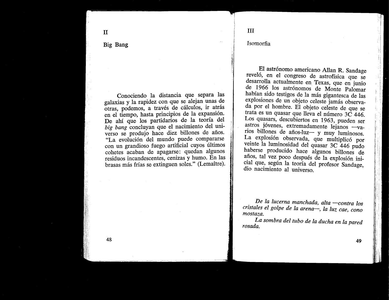
Here’s an example; this is from an edition of Big Bang published by Fata Morgana in 1973. This edition is bilingual in Spanish and French; if the text in the back is to be believed, it’s the first printing in both Spanish and French. No translator is given, and it’s possible the translator is Sarduy himself. Here’s how the third section of “Big Bang” looks:
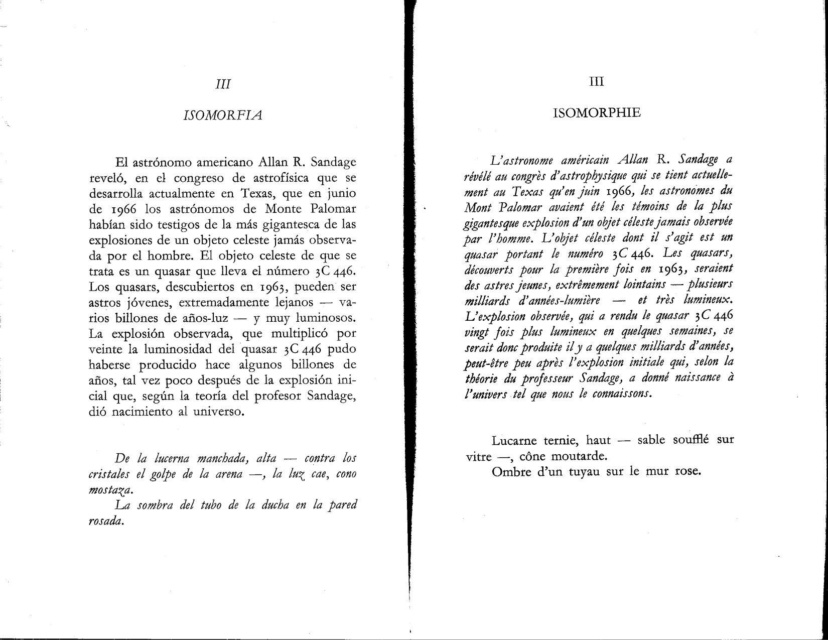
First spread of section 3 of “Big Bang” in Fata Morgana edition (1973).
Second spread of section 3 of “Big Bang” in Fata Morgana edition (1973).
The first thing one notices here is how all the niceties of making a translation match the original have gone out the window. What’s in roman in the original is italic in the translation (and vice versa). The French doesn’t duplicate the Spanish; it complements it. And this approach exacerbates the problem of design in translation: italic is generally much narrower than Roman, so you can see that the first paragraph of the French is a line shorter than the Spanish (even though they’d take up very similar amounts of space).
A textual scholar could look at this spread and say a lot more. With a little more scrutiny, you notice that the Spanish has probably been typeset by a French speaker: the spacing before punctuation is French-style rather than what’s normal in Spanish. Does that mean that Sarduy wanted his Spanish to look like French? Or does it mean that a typesetter decided that his Spanish should be cleaned up to look more respectable? Authorial intent can be very hard to suss out from printed work.
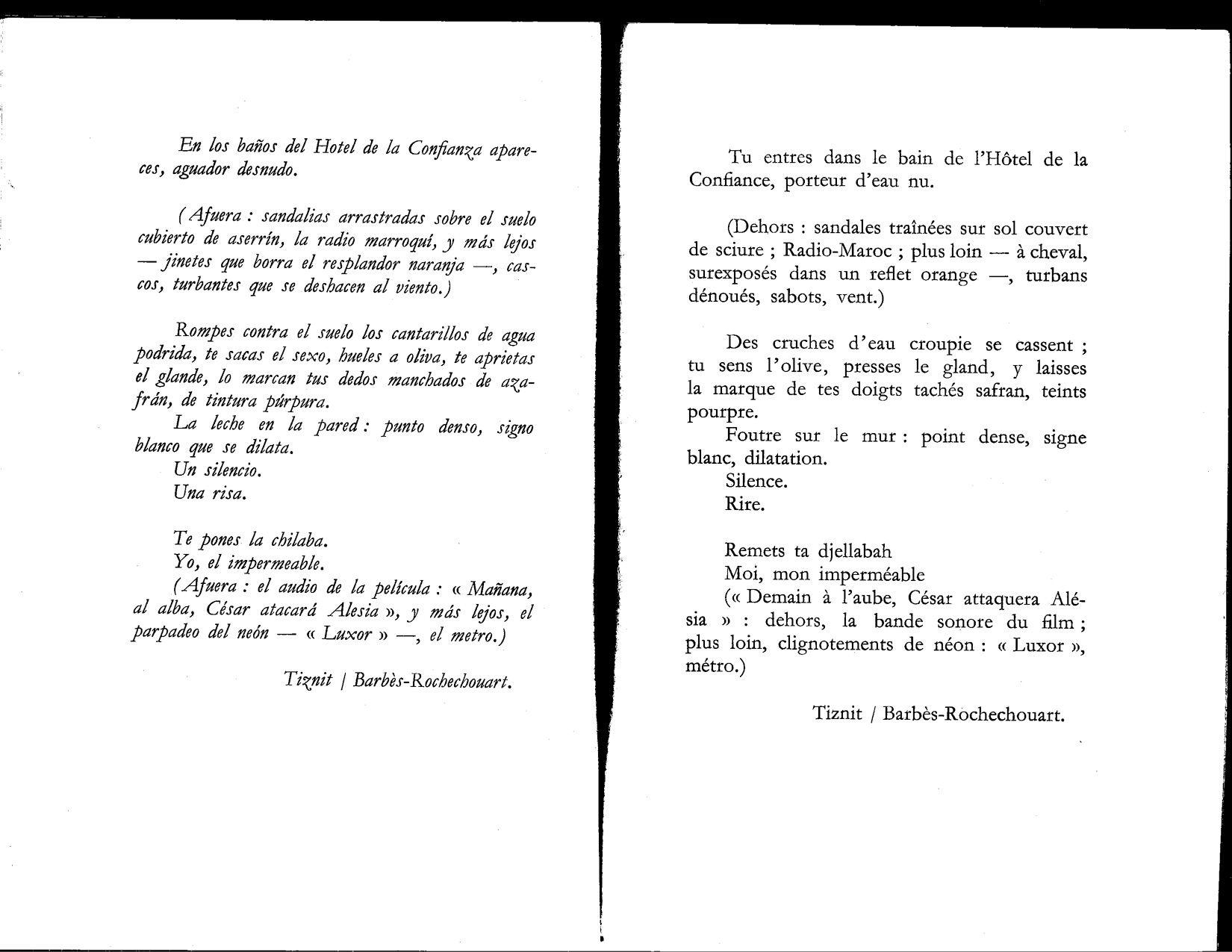
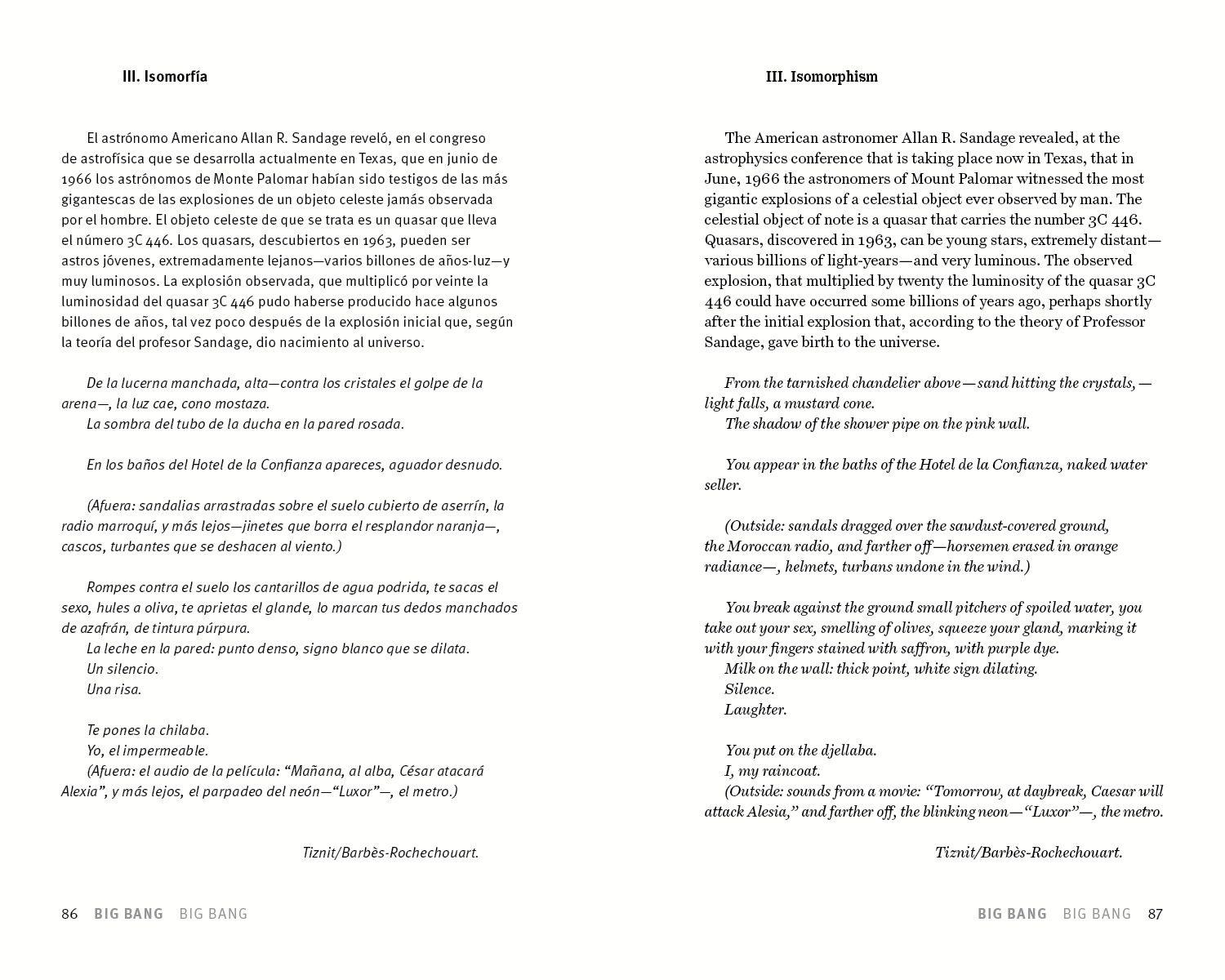
Here’s another spread of the same poem. This is from the current Spanish edition, published by Fondo de Cultura Económica in Mexico in 2007:
Section 3 of “Big Bang” in 2007 edition.
This is not as beautiful an edition as the Fata Morgana edition, but it does include all of Sarduy’s poetry, which is something. Economic concerns, which can never entirely be escaped, are visible here: they’re trying to cram as much poetry as possible into as little paper as possible. The line breaks are all different; indentation is different; punctuation is different. The text has less space to breathe and it feels different. The text is different as well: the attribution at the end is not “Tiznit Barbès-Rochechouart” rather than “Tiznit / Barbès-Rochechouart.” “Quasar 3C 446” has become “Quasar 3C-446”. (This is, of course, a real quasar; the earlier editions seem to have been more correct here.)
And here’s another one. This edition is from Tusquets Editor in Barcelona; it’s a collected poems up to 1974.
First page of section 3 of “Big Bang” in 1974 edition.
I’m not including the second page, but you can see that this version of the poem presents another graphical variation. While the line breaks of the first paragraph are exactly the same as the Spanish/French edition – suggesting that might be Sarduy’s preferred way of presenting the poem – the punctuation is more Spanish. But this version includes several lines of space between the first paragraph and the lines after it.
Let me state again that I’m not a Sarduy scholar! I am just trying to figure out how the poem should look on the page of our book. How do we decide what this should look like? There are several countervailing forces. The editions of 1973 and 1974 were published while Sarduy was alive, and he may well have had input into how they appeared. The 2007 edition was published after he was dead. However: I don’t know what Sarduy thought of the 1973 and 1974 editions; he may have hated one or both of them, or he might have been indifferent. The 2007 edition is the critical edition that’s used most often today; because it’s later in time, it may have corrected mistakes in earlier ones (though it may also have introduced new ones, this being the nature of print). The 1973 edition looks like the one where the most graphic care was put into the book: it’s a beautiful book, and it was clearly put together by someone who was thinking about things.
How did we solve the problem of layout of this? Here’s the spread from Footwork:
The Circumference section 3 of "Big Bang"
Constraints are visible here. Because we wanted to make it facing-page and to work as a unit, we’ve tried to get the whole thing to fit on one page, which is a tighter squeeze than I would like. (The alternative would have been to have a couple of lines on the next spread, maybe abandoning starting each section on its own page. This wouldn’t be quite as nice on the whole.) We also have a Circumference house style: we’re using different families of type for the original and translation (Meta and Century Supra, respectively) and that impacts the layout as well – Century Supra’s wider than Meta. Prose we generally set with a ragged right rather than fully justified. So there’s some variation here, but it’s within the realm of what’s been done before, and I think this is defensible.
A further complication comes into this, of course: the technology that was used to put these books together, and the way that impacted them. If you look at the French text of the 1973 edition, for example, you’ll see that the numbers in the italic section are roman. There’s a decent chance this book – as a fine press edition – was set by hand with actual metal type; they didn’t have italic numbers, so they used Roman ones. I would guess that the 1974 edition wasn’t set by hand from metal type; rather, this is probably film typesetting. And the 2007 book was almost certainly done on a computer – probably using Adobe InDesign (which is how we’re doing our books at the moment). I won’t go on about the technical differences between these systems, but I will note that different processes allow for different amounts of authorial intervention. Even if the author’s actually at the press, changes in metal type are complicated and expensive. They’re more possible with film typesetting, but still expensive. With digital typesetting, authorial corrections can go on forever. They also require different levels of expertise: anyone, with a few hours of training, can typeset a digitally printed book, while a professional is required for film or metal typesetting.
These effects are exacerbated with graphic poetry. What can be done with metal type is different from what can be done with film typography, which is different from what you can do with digital typography. With metal type, for example, you’re limited to the characters, typefaces, and sizes that you have in metal. It’s much harder to set type that’s out of alignment with everything else on the page. Here’s a good example of that: two of the poems initially published as part of Mood Indigo. First, the edition from 1974:
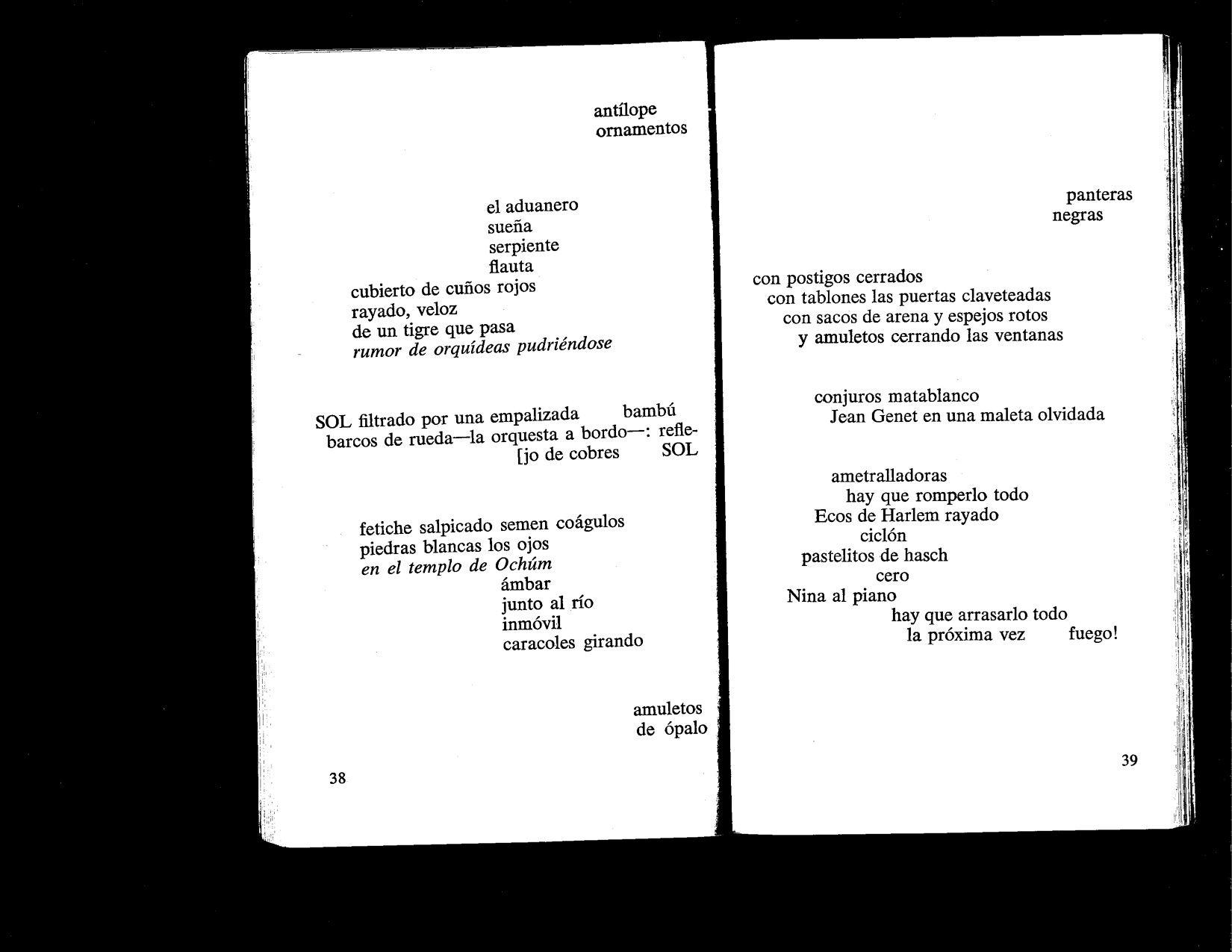
“Moon Mist” and “Echoes of Harlem” from 1974
And here are the same two poems in the 2007 edition:
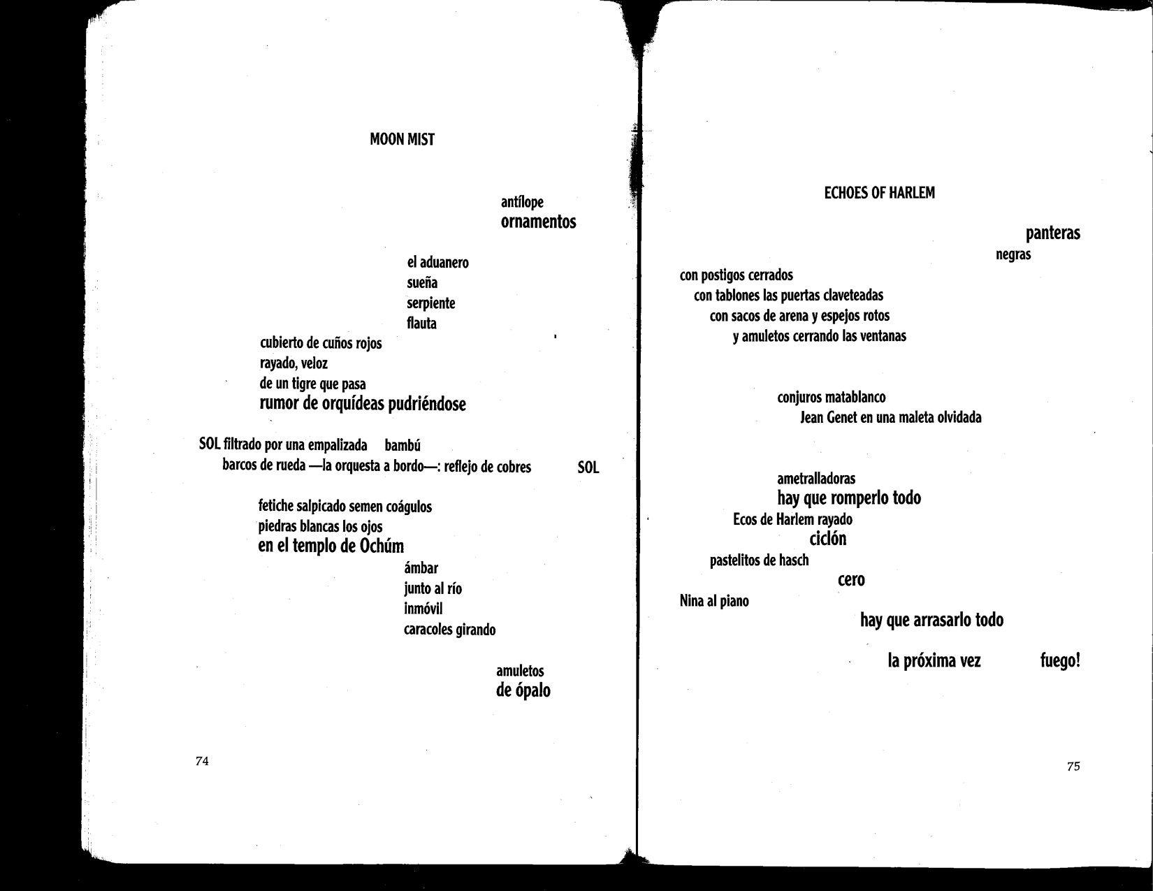
“Moon Mist” and “Echoes of Harlem” from 2007
The first thing you notice is that the 1974 edition doesn’t actually give the poems titles: there’s a table of contents for the book, but it just lists “Mood Indigo”. In the 2007 edition, you might be forgiven for thinking that the title is a part of the poem.
One thing that’s very interesting in the 1974 edition is an indication of technological constraints: in the middle of the left page, you see a line that says “[jo de cobres SOL”. This usage of the square bracket isn’t seen very much any more – it’s hard to make InDesign do this – but before computer typesetting, if a line of poetry was wider than the measure of the text column, the overflow would be put on the right side of the page with a “[” in front of it to signal that it was an overflow line. This is a continuation of the previous line, which should read, in total, “barcos de rueda—la orquesta a bordo—: reflejo de cobres SOL”. This kind of overflow ruins a graphic poem; the “[” is an indication that you’re not seeing what the author wanted you to see. Why not? Probably because to make that line fit correctly, they would have had to use much smaller type, which might have made the poem hard to read if the book was small. Maybe they didn’t have type that size. Maybe they wanted to keep things consistent.
The other thing that’s different between the two is the way that words are emphasized. In 1974, “rumor de orquídeas pudriéndose” is italicized; in 2007, that phrase is made slightly bigger than the text around it. A number of words and phrases in both poems get this treatment in 2007 rather than the just two phrases in 1974.
How do we decide what to make of this? The different type sizes would have been harder to pull off in print when Sarduy was writing this, and I can imagine that he was talked into just accepting some italics for emphasis because it would be less of a headache. I’m not sure I love the effect of the 2007 version: the distinction in sizes isn’t very great, and the eye has trouble telling the two sizes apart. (The overly quirky choice of font isn’t helping things.) That said: if these poems were initially composed by hand, making words bigger seems very natural? Graphically, the 2007 edition does work better than the 1974 version, aside from the randomly placed titles. This works as a spread as well: you can almost see a white diamond in the negative space between the two poems, with SOL in the middle. That looks intentional.
Our version is a compromise. Because we’re doing this facing page, we’ve split up the spread, so we have “Moon Mist”/“Moon Mist" and “Echoes of Harlem”/“Echoes of Harlem” rather than "Moon Mist”/“Echoes of Harlem”. The negative diamond between the two poems is lost:
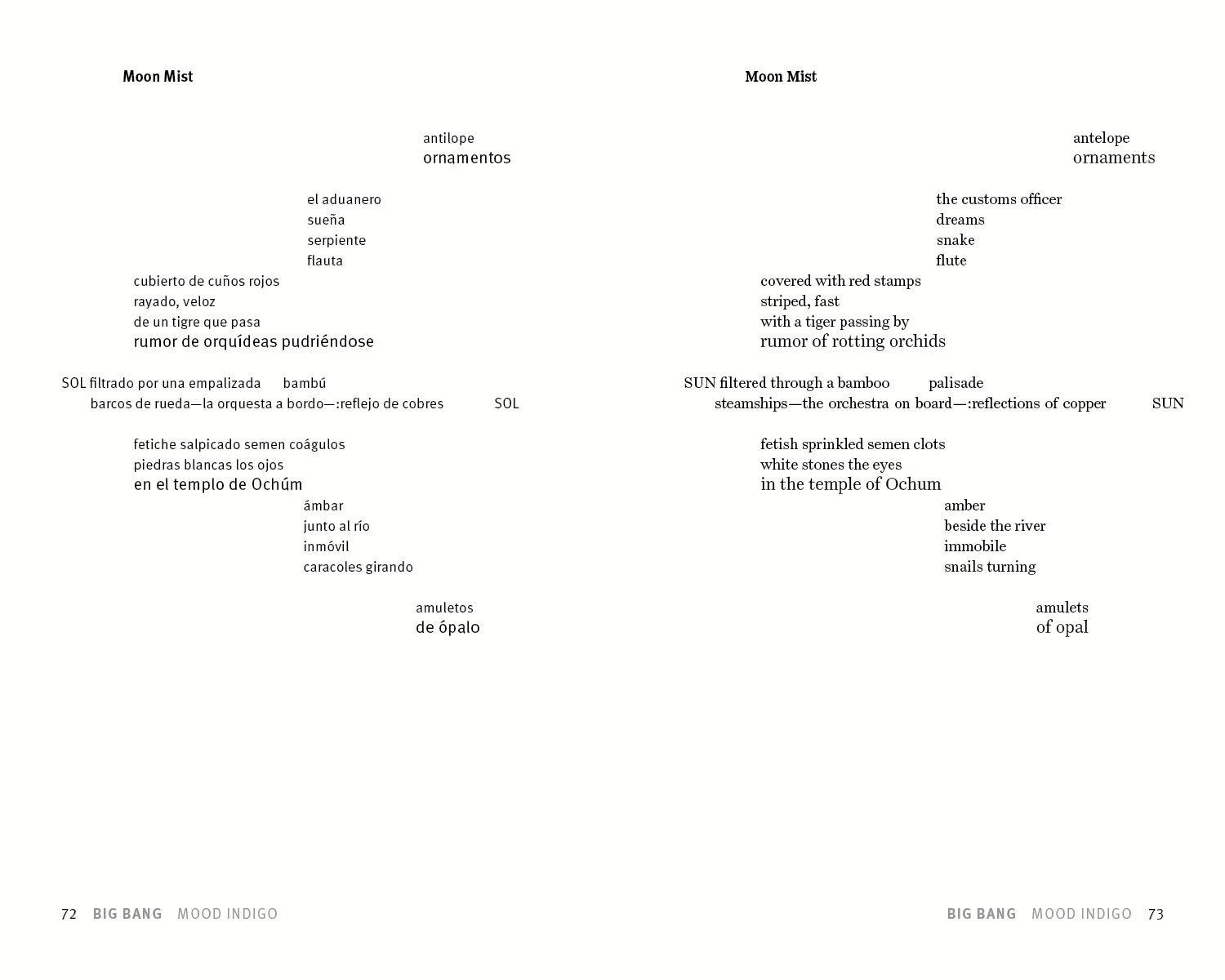
Circumference version of “Moon Mist”
Though it’s surprising to see something similar comes back in “Echoes of Harlem”:
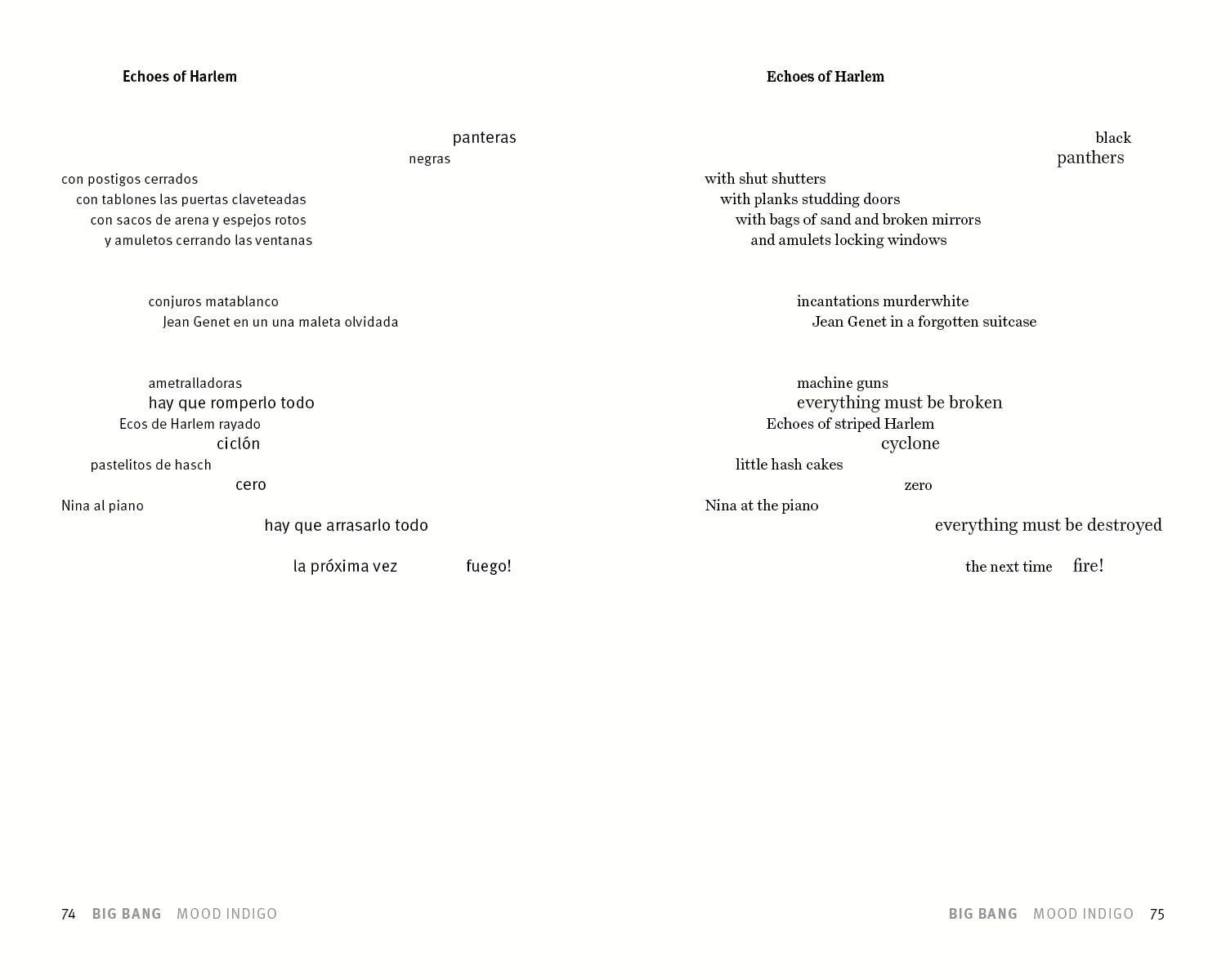
Circumference version of “Echoes of Harlem”
Because we have a standard position and styling for titles, they can’t be as easily confused for part of the poem. (One does wonder a little if they should be there at all.) We’ve broken our standard grid a bit to fit the long lines – on the right, you’ll notice that “SUN” and “everything must be destroyed” end up going further into the right margin than is usually allowed. I ended up following the variable sizing of the 2007 edition, though I increased the contrast a bit.
Some changes are forced by translation: in “Moon Mist," the space before “SOL” and “SUN” in the long line is unequal because the English text is longer than the Spanish. (Things get more out of whack in the lower right of the poem, where choices have to be made about the relationships between the relative spacing of the words.) In the upper right, “panteras negras” becomes “black panthers,” though the emphasis stays on the noun.
I think this is acceptable because we’re facing-page; it’s obvious just looking at it that the English is a version of the Spanish. (By contrast, it’s not obvious, if you pick up the 2007 Spanish edition, that what you’re seeing might not be what Sarduy actually envisioned.) Our book is the end result of a long process where different versions – and scans of previous editions as reference points – were sent back and forth: a dialogue trying to get to the bottom of what the best edition we could make would look like. Our book is, ultimately, a translation, and one of the ways that it is a translation is graphical. Like any translation, it’s going to be an interpretation.
Footwork is on sale for June!
On June 8, 1993, Severo Sarduy died due to complications with AIDS. In honor of the anniversary of Sarduy’s passing and in celebration of pride month, Circumference is offering Footwork at a discount price of $15 in June. As one of Sarduy’s epitaphs to himself says, “The dead man’s out to dance.”
David Francis talking about Severo Sarduy
A quick note that David Francis’s conversation with Shawn McDaniel is finally available on Yale’s YouTube channel. It’s a great discussion about the book and issues involved in translating Sarduy into English.
Footwork events!
Footwork is out in the world! Which means that it’s time for events; and, the world being what it is, a lot of the events that will be happening will be online.
First up: on March 22 at 4 p.m. EST, David is having a conversation with Shawn McDaniel about translating Severo Sarduy at the Yale Center for the Study of Race, Indigeneity, and Transnational Migration, co-sponsored by the Whitney Humanities Center and the Yale Translation Initiative. That’s on Zoom and it looks to be open to the public. More information and a link to register is here. There’s a poster:
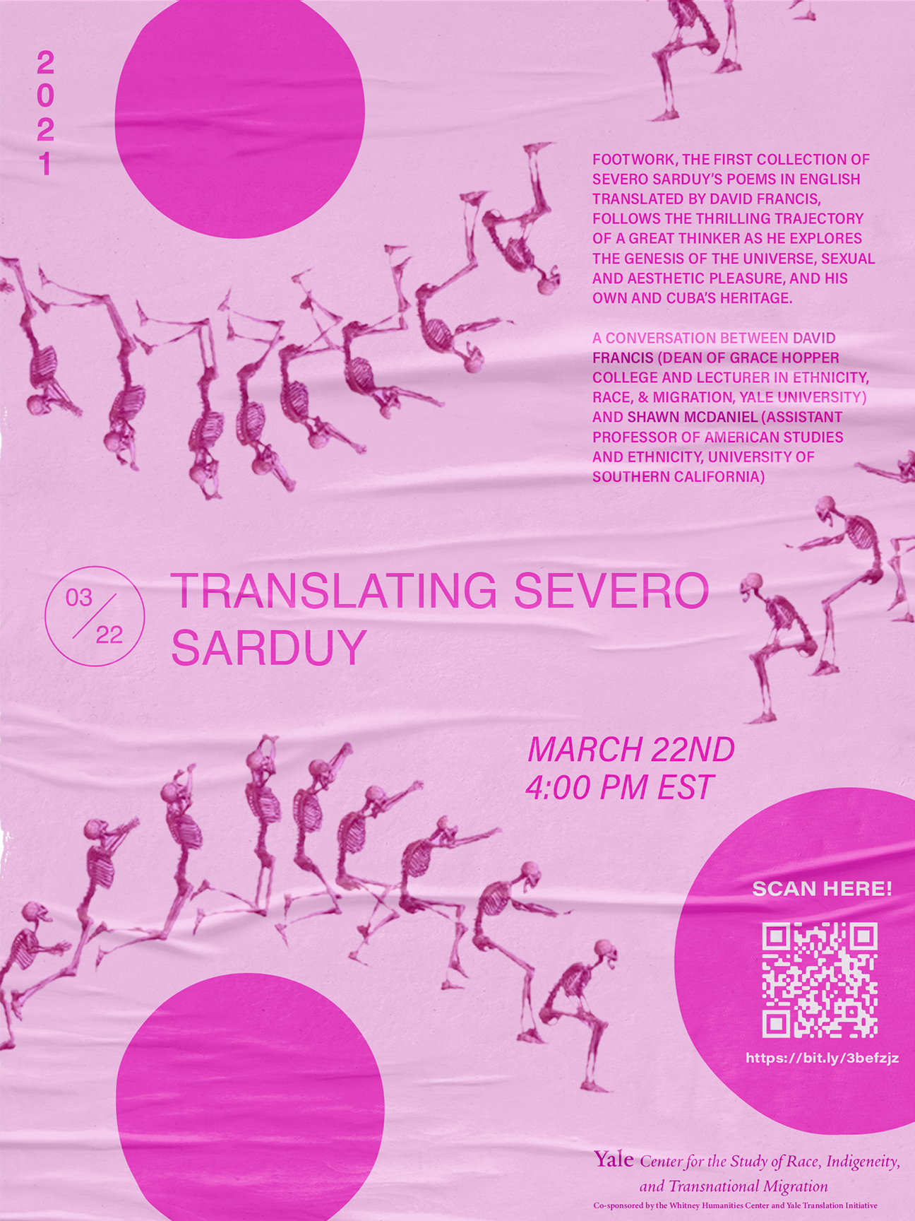
I think that’s the first QR code that Circumference has been associated with, a proud milestone.
Next! On April 12 at 7 p.m. EST, there’s another Zoom event hosted by McNally Jackson in New York. Info and registration is here. David will be talking with Wayne Koestenbaum and Raquel Salas Rivera – who both gave very nice blurbs to the book. That should be good too!
Footwork is out!
David Francis’s translation of Severo Sarduy’s Footwork is out in the world! If you haven’t picked up a copy – or your local bookstore doesn’t have one – feel free to buy one from us! We’ll have some more background on the book up here soon. It took a while to get out into the world, but it’s worth the wait!
Also in the “we are slow” department: a very long time ago – November of 2019 – we heard friend of Circumference Eliot Weinberger give the keynote address at the George Town Literary Festival. You can read it online at Asymptote; it’s nice to see Pauline Fan’s translation of Kulleh Grasi's Tell Me Kenyalang get a mention there! Eliot Weinberger’s Angels & Saints is fantastic and you should pick up a copy of that if you haven’t already.